 2024 – Present
 2–4 teammates
Sublayer was born right as AI jumped from the humble world of research papers to upstart LLMs beginning to form consistently coherent responses when prompted. I joined the small team to help shape product design across their initial product offerings. As code was getting cheaper by the month, we realized taste wasn't, so in an era when anyone can vibe-code a working app in a day, what makes a product feel worth using? I worked on wildly different things while I was there (a developer community, Mac apps, iOS apps, and SaaS tooling), and my job was the same on all of them, which was to make each one feel like people made them for people to use.
Our mission was to keep chasing where AI was going to be, not where it was currently. In practice that meant we moved quickly onto new experiments as we watched the models evolve and become more capable, so a project that made sense in the spring could be the wrong thing to keep building by the fall.

AI-powered code reviews for engineering teams

A shareware app to help you herd your MCPs
A dev meetup defining Ruby's place in AI

A Desktop Multi-Agent Orchestration tool
Augmentations started as a tool for engineers to automate the stuff that kept them from building. Things like code reviews that were context-aware, auto-generated summaries of the teams progress tailored to technical and non-technical leadership, and even customizable reviewers based on expertise or ethos.
See an archived version of augmentations.ai ↗Augmentations was the follow-up to Blueprints, an earlier Sublayer tool that plugged into your editor and generated code from the patterns already in your codebase. The team wanted to keep exploring tools built for engineering teams, so we rolled what we learned there into an alpha that got stood up quickly with AI-assisted coding tools, the same way Blueprints had been. By 2024 the product wasn't the hard part. A capable alpha could be built in a week. The hard part was standing out in a sea of upstarts shipping near-identical tools.
What I actually inherited was a partially vibe-coded prototype. As I grabbed that baton, my first order of business was to audit it, pulling everything together to see what we were starting from. It looked like the default output of a generic app, but the features were there, we just needed to organize them and package them into something more compelling.
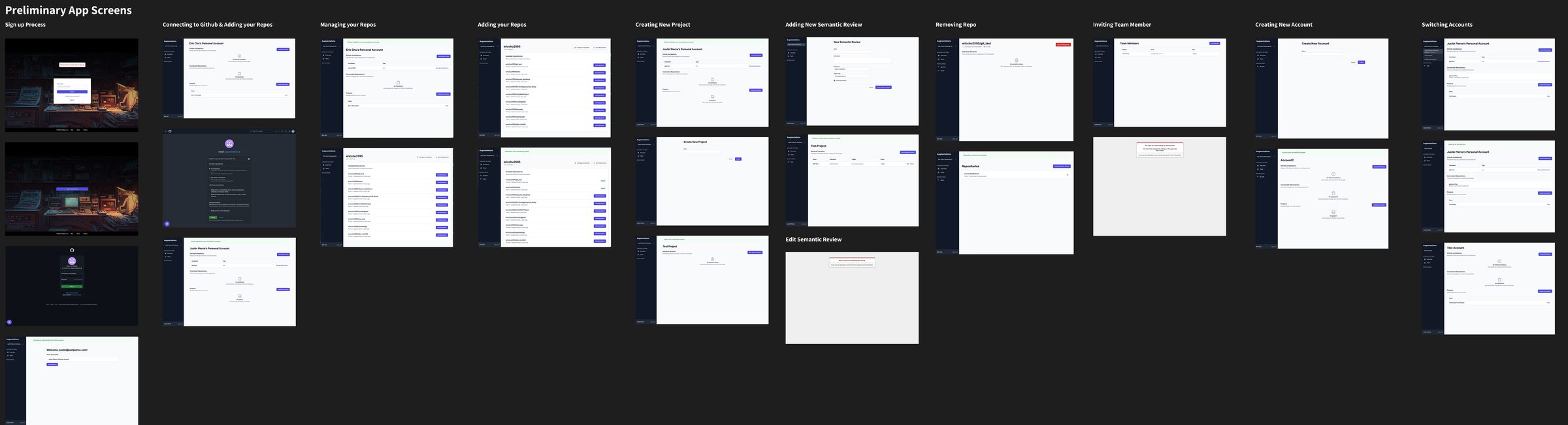
Auditing the generic UX of the alpha
Before any of it could look like anything, I had to know what the product was actually made of. Accounts, orgs, projects, repositories, linting rules, summaries, and integrations all had to nest in an order people could hold in their heads. Alongside the information architecting, I gathered the actions users would need, sorted them, and started organizing them for the team to align with. It's tedious, and it's still the fastest way I know to find the screens you forgot to design.
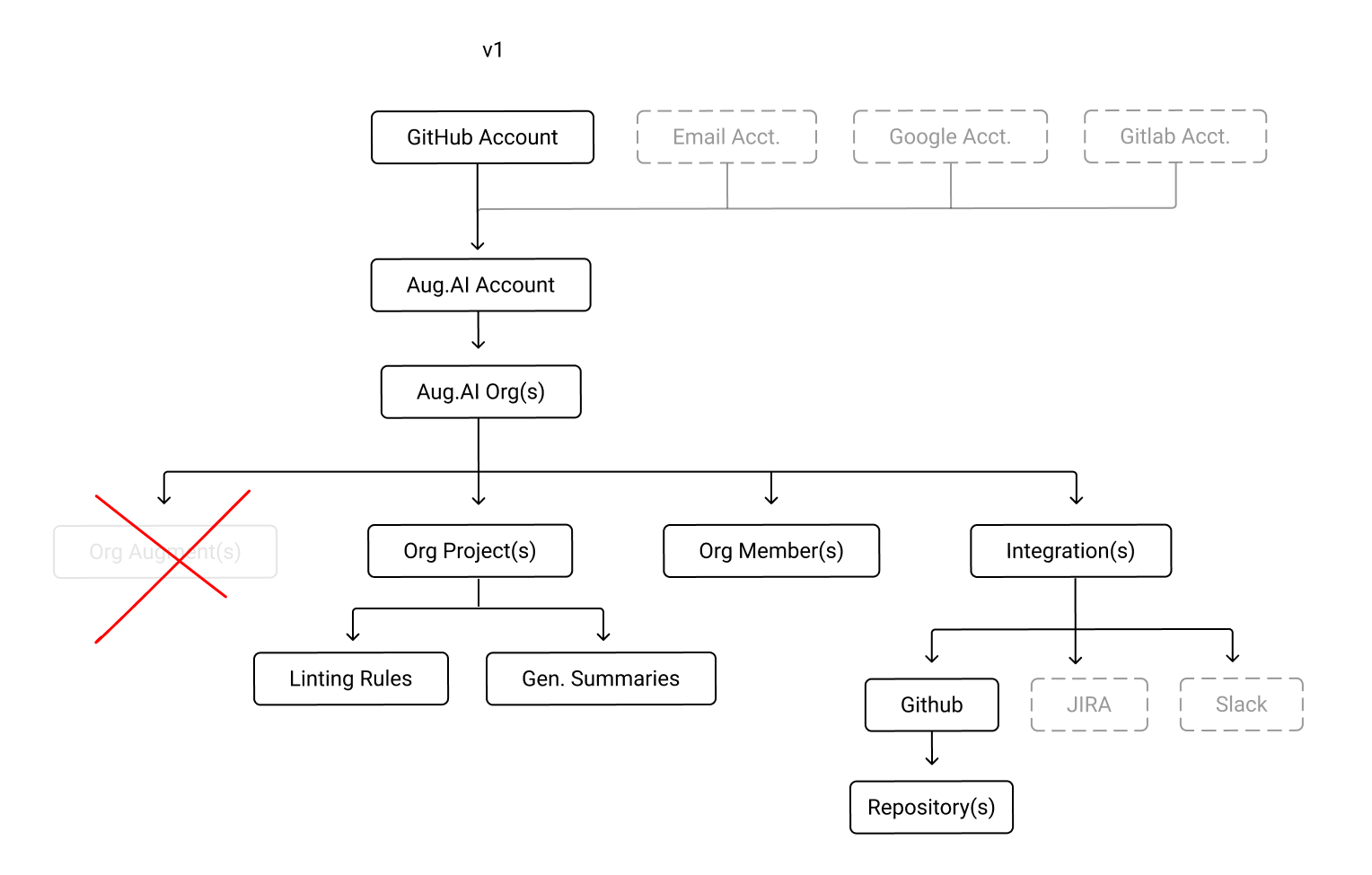
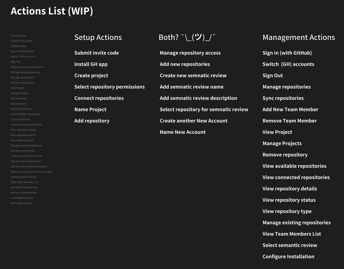
Optimising the IA and determining what users could do
I also took a run at something more adventurous. While discussing inspirations and talking about video game UIs, I sketched out a more tactile approach to onboarding. It didn't ship, but it helped the team see where we could go in the future. We later used some of this exploration for APM, our agent orchestrator tool.
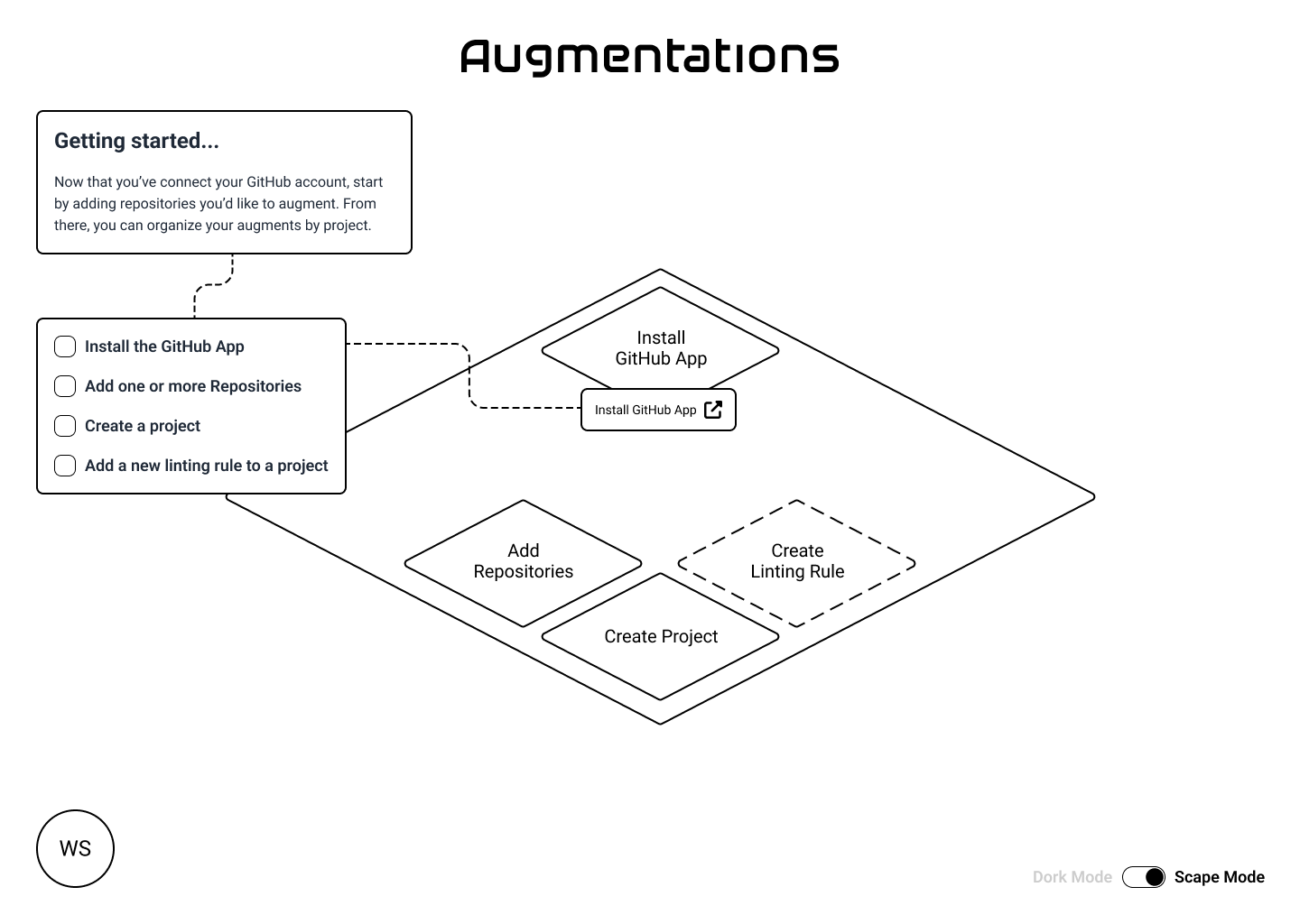
An exploration into experimental UI
We knew early that we'd have to differentiate on feel. Most products in the vibe-coded era wear whatever generic UI the model spat out, so branding became a way to signal substance. I pushed for a custom, human-designed logo and a UI that reflected the actual vibe of the product instead of the default aesthetic AI reaches for. We wanted it to look like a tool a team would trust with their codebase.
The reference pile landed in the early 1980s almost immediately. VHS sleeves, luggable computers, oscilloscopes, patch bays, and the rainbow stripe that used to mean a computer company took itself seriously. An augmentation is something you bolt onto a workflow, so I wanted the whole thing to feel like equipment instead of another SaaS dashboard.
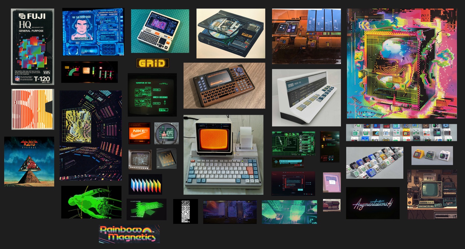
Harnessing a look and feel: Retro tech, throwback graphical interfaces, and a little bit of digital chaos
The branding for Augmentations started as just a logotype. While discussing the old school computing era more and more, I decided to explore a mark to pair with the logotype. I found inspiration in throwback logos sliced into horizontal lines and evolved and iterated from there.
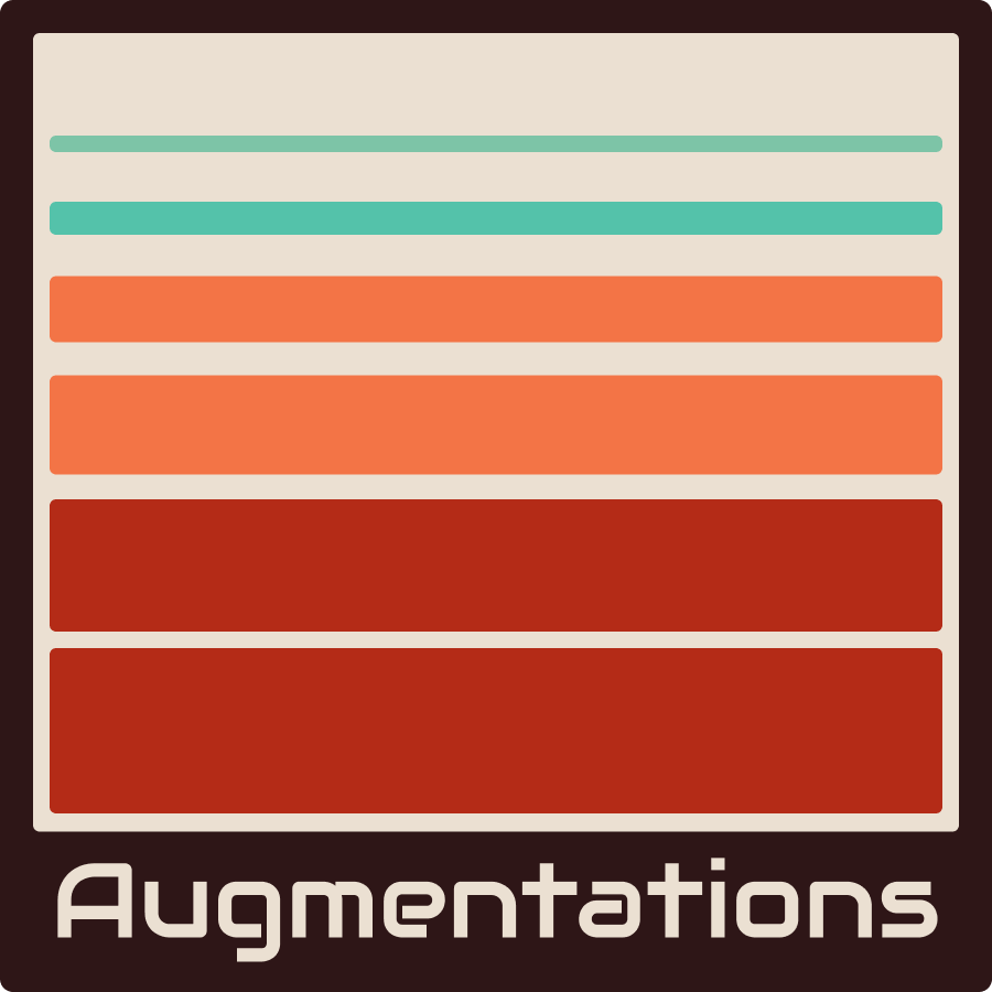
Initial mark exploration
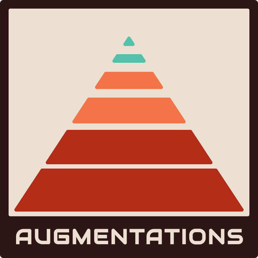
Iterating through options
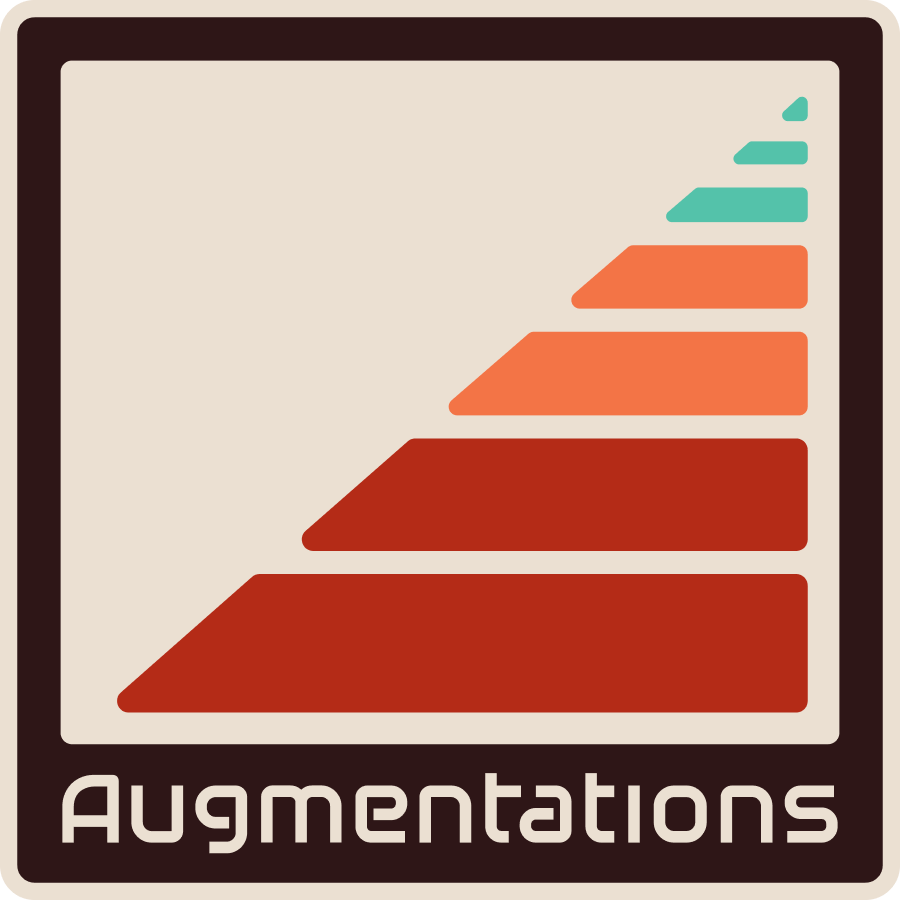
Stylizing the “triangle” to echo Sublayer
The palette came off the same shelf as the references. Deep brick red into orange into teal, on a warm cream, boxed in a rounded dark brown frame like a label on a piece of gear. The wordmark carries the same stripe underneath it, which is the part people actually remember.

The wordmark does the heavy nostalgia lifting
For a long stretch the site had one job, which was collecting early-access signups, so it had to land the whole idea in a single screen. I ran four directions at it, all of them some version of a room full of equipment.
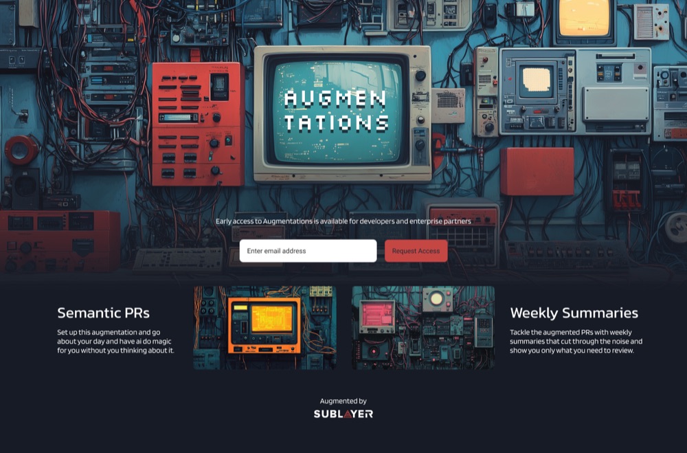
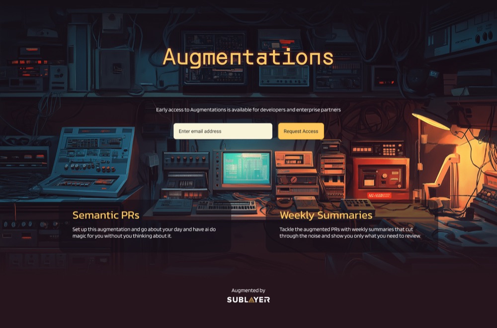
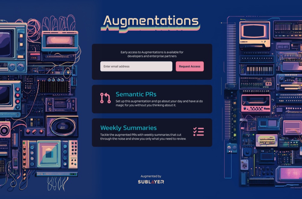
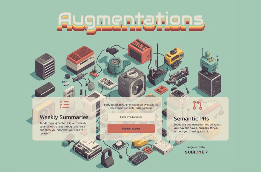
The dark workbench won, because it was the only one that felt like a place where work happens. That version ran as the site for months while the product caught up to it.
Everyone who signed up got a welcome email in the same clothes, because a plain-text confirmation after that page would have felt like a different company.
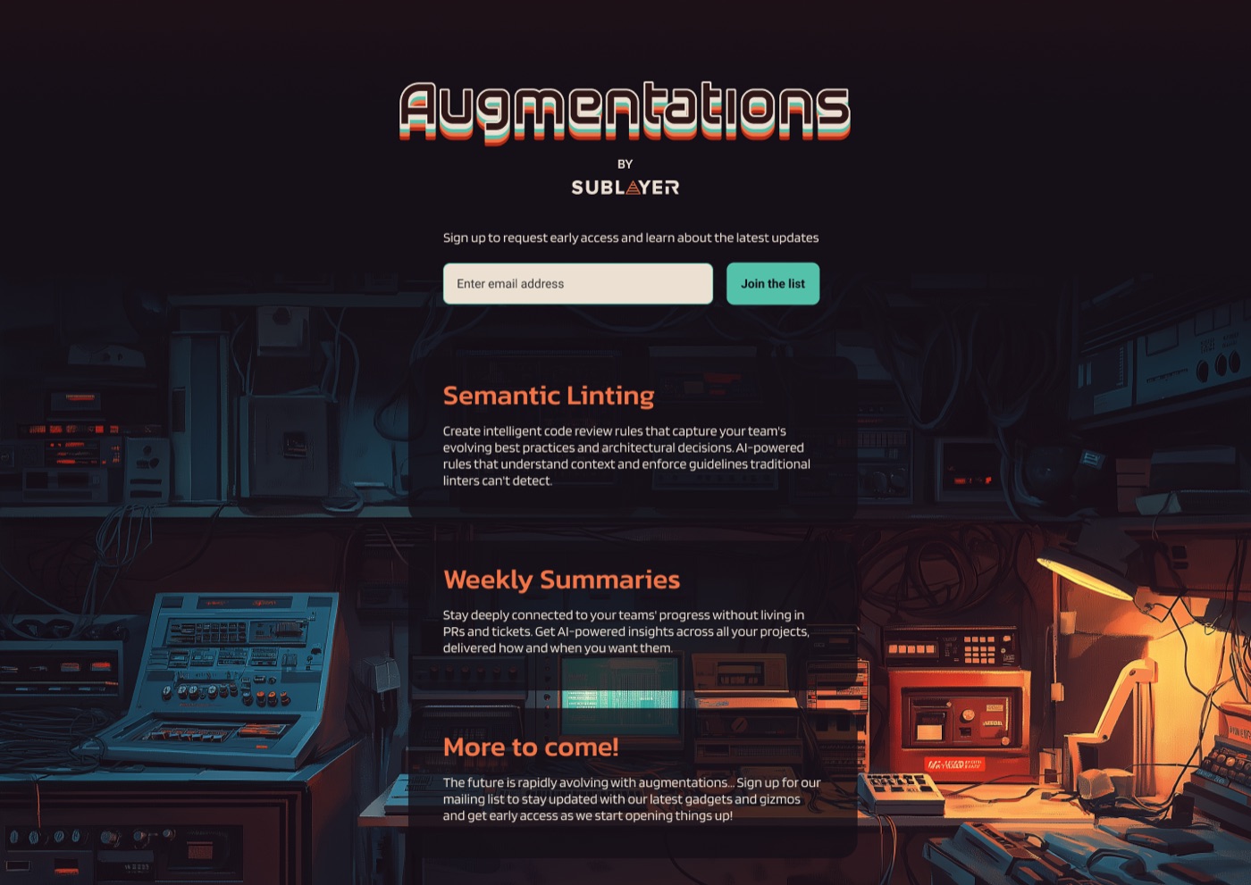
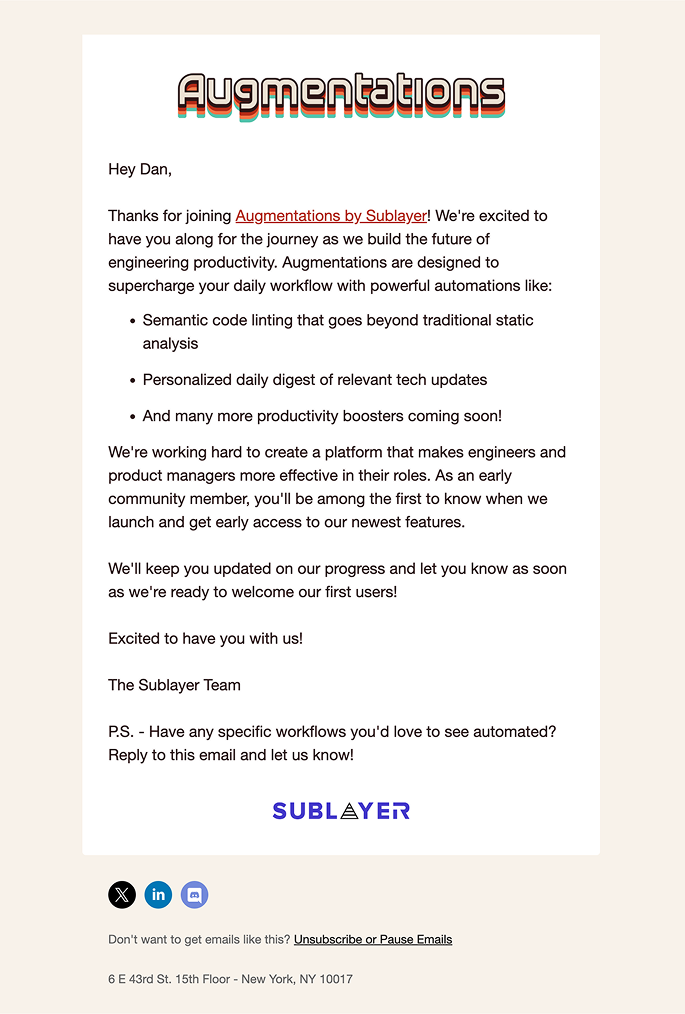
The interim augmentations.ai landing page for early access and welcome email
Once there was a real product to point at, the site grew up. The workbench stayed as the hero, and everything under it got room to explain semantic linting and weekly summaries properly, with the interface doing the talking.
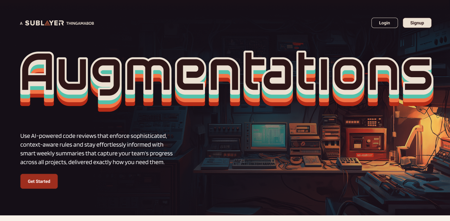 Open the archived site ↗
Augmentations.ai landing page, archived here since the site came down
Then the brand went back through every screen from the audit. Same flows, same structure, wearing something we chose on purpose. The project overview is where it all comes together, with a project's lints, summaries, and doubles on one page.
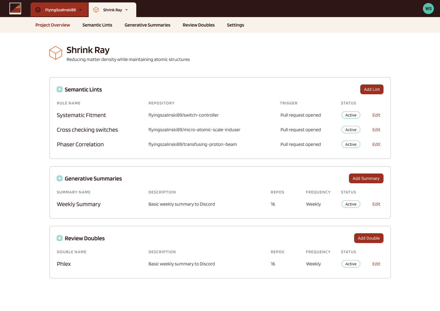
A project's semantic lints, generative summaries, and review doubles in one place
The two features people came for were semantic lints, where you describe a rule in plain English and test it against a real pull request before turning it loose, and review doubles, which are prepackaged reviewers with opinions about a given stack. Both needed the same thing from the design, which was somewhere to read what the rule would actually do before you inflicted it on your team.
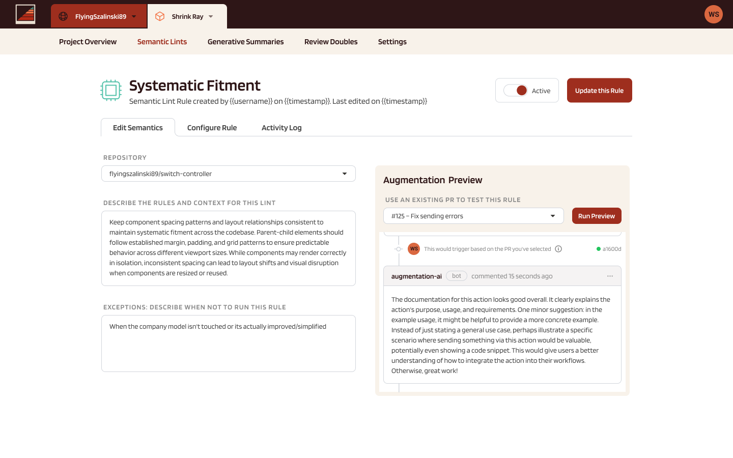
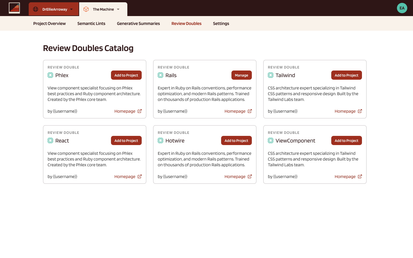
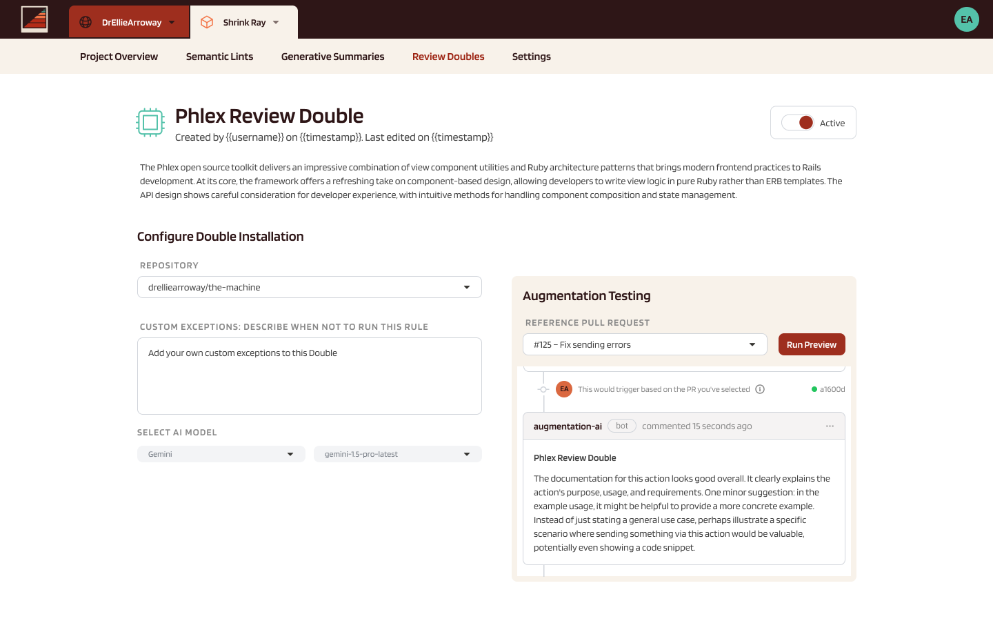
Writing a lint and previewing it, browsing the review doubles catalog, and configuring one you've added
We were quick to build and quick to launch, then widened the product's reach by adding customizable summaries, the same project activity framed for whoever was reading it. A technical, C-level audience could get the engineering detail, and a non-technical CEO could get the plain-language version.
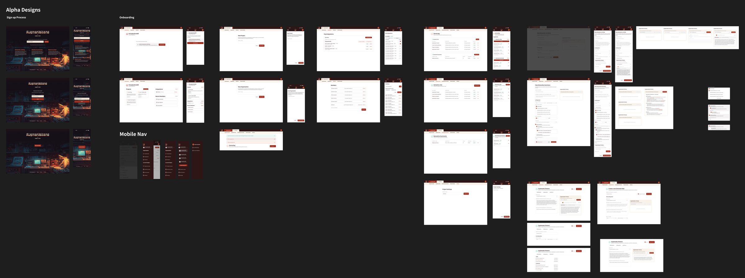
The redesigned product, end to end
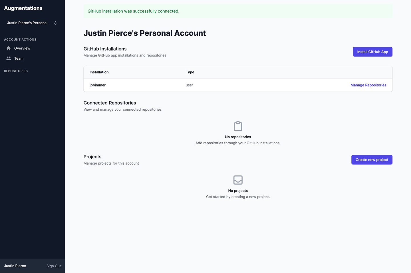
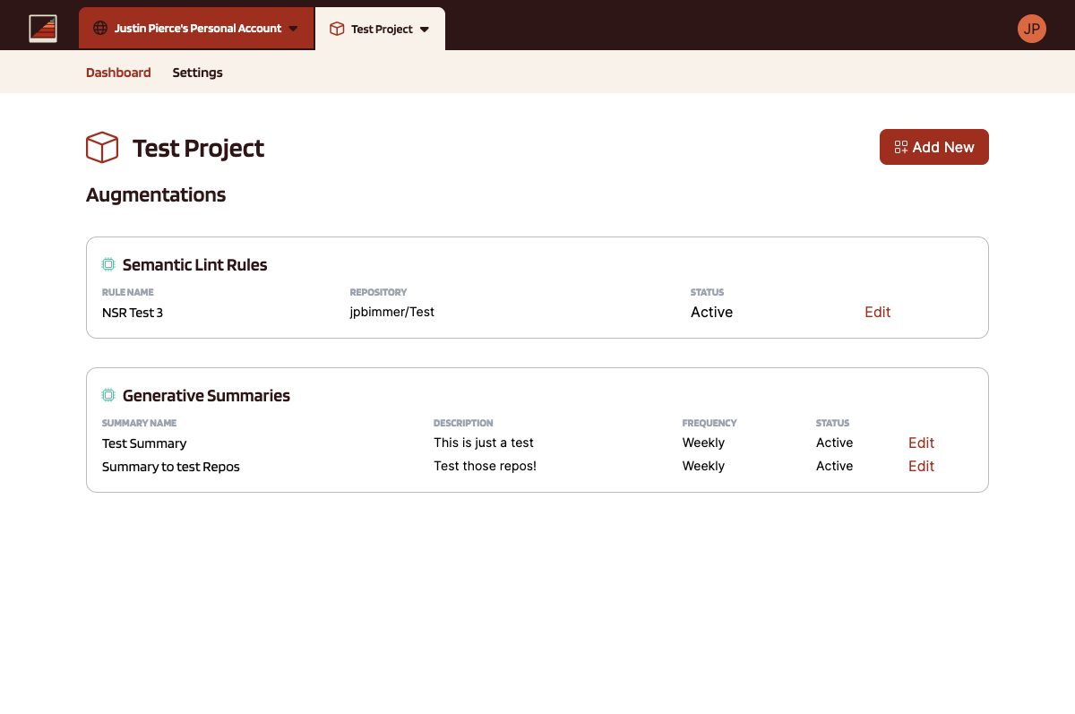
The alpha worked, but looked like every other weekend build. The redesign gave it an identity.
Eventually we put Augmentations into stasis. As AI coding tools got more sophisticated, it became clear that self-management tooling wasn't a strong enough moat. The underlying models were absorbing the problem faster than a standalone product could defend it, and there's no designing your way around that.
A shareware application bred to help you herd your MCPs. Manage, organize, and control your Model Context Protocol servers without losing the plot.
Visit the site at protocollie.io ↗The speed was never the story we wanted to tell. We wanted to ship something that felt established, closer to an app a team would have spent weeks on. That mattered for trust more than for effort. When software looks considered, people believe it will take care of their setup.
We were reaching for old-school freeware, the good ol' days of programs that said "hey, throw us a few dollars if you can, but we'll never require you to pay for this." You can see it in the friendly Border Collie character (bred to herd, naturally organized, relentlessly focused), the warm marketing site, and a tone that talks to you like a friend instead of a funnel. The whole thing is laid back on purpose, because the app is small and straightforward and the brand should act like it.
Protocollie came out of a debate Scott had been having for a while, which he wrote up as The Great Flood of Adequate Software. Once a genuinely useful tool takes an afternoon to build instead of a quarter, charging rent on it every month stops making much sense.
So we built an app we needed and put it out on old shareware terms, where you pay what you think is fair or you pay nothing and use it anyway. Which led to our design approach.
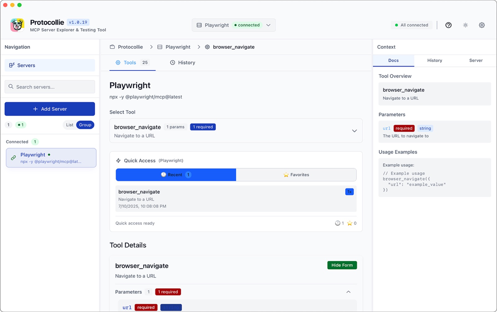
Making it a Mac app to manage and organize our MCP servers, connect AI agents to databases, APIs, local files, and third-party services was partially because vibe-coding got good enough that it could and it was less overhead to host, oh and because who wouldn't want their own dock icon? Scott, Sublayer's CEO, vibe-coded the entire thing over a single weekend.
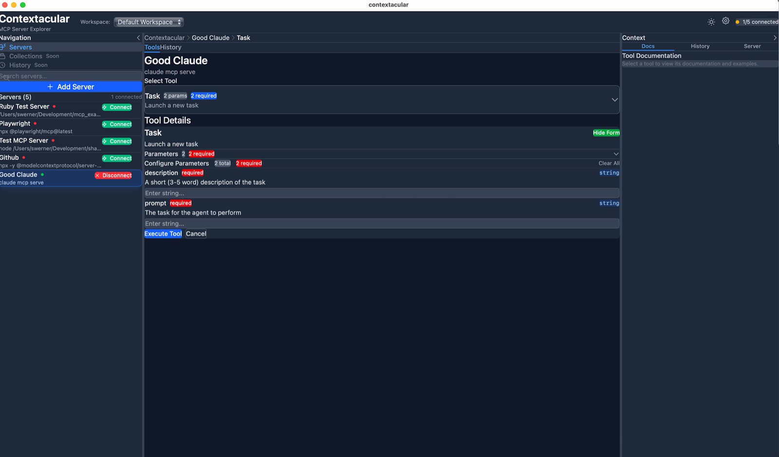
With a flashy front door full of personality, we still wanted a usable tool. Once you're in, Protocollie is a straightforward Mac utility: add a server, see every tool it exposes, read the docs, and run the thing to confirm it works. The dog waves at you from the title bar and then gets out of the way.
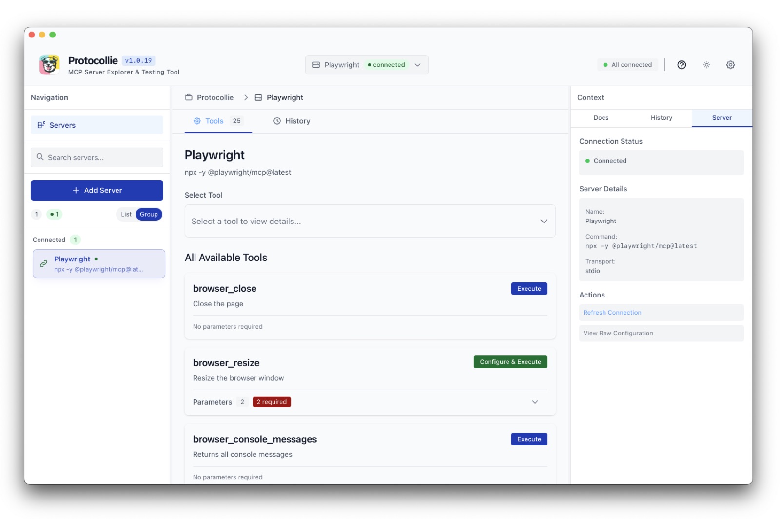
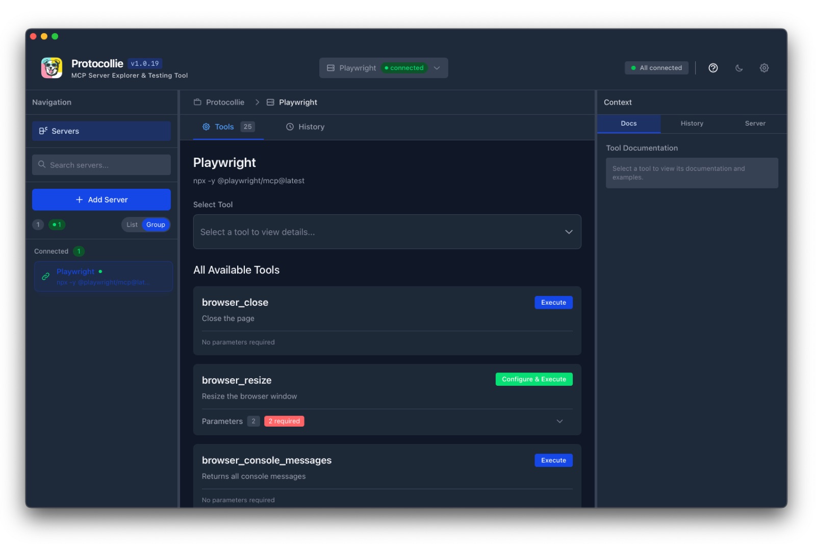
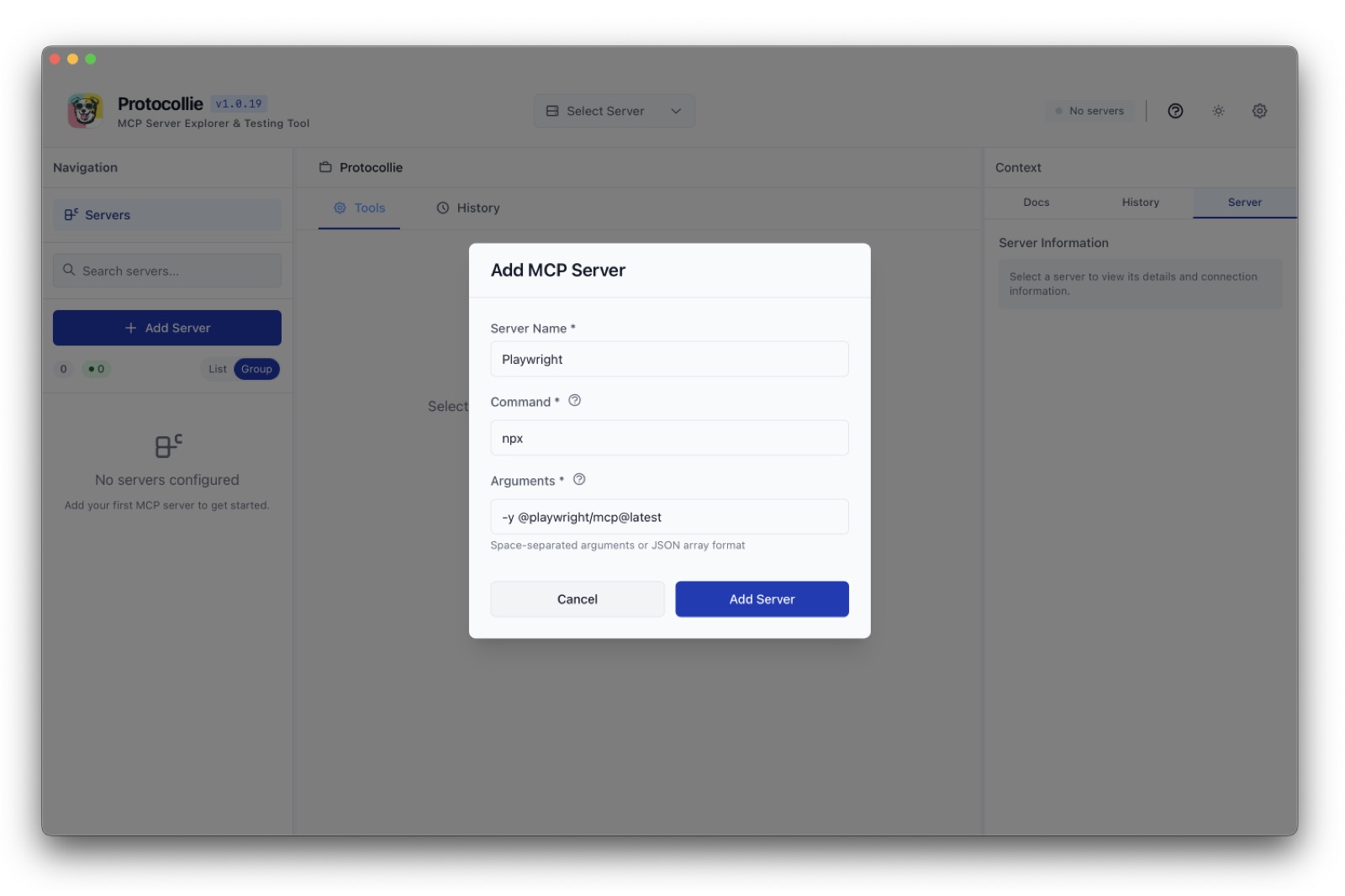
Three columns: your servers, the tools they expose, and the docs for whatever you have selected. Light and dark, plus the setup dialog most people meet first
The mascot came first, because the mascot was the whole personality and we wanted personality to make us stand out from the crowd of other vibe-coded apps. The name for the app started as a pun and evolved from there, but we didn't want to use the most famous collie's likeness and had to dig a bit deeper. Luckily for us, the chill vibes we were drawn to took us back to our childhood. That's the feeling we wanted: bright, goofy, and unmistakably from the era when software came in a box.
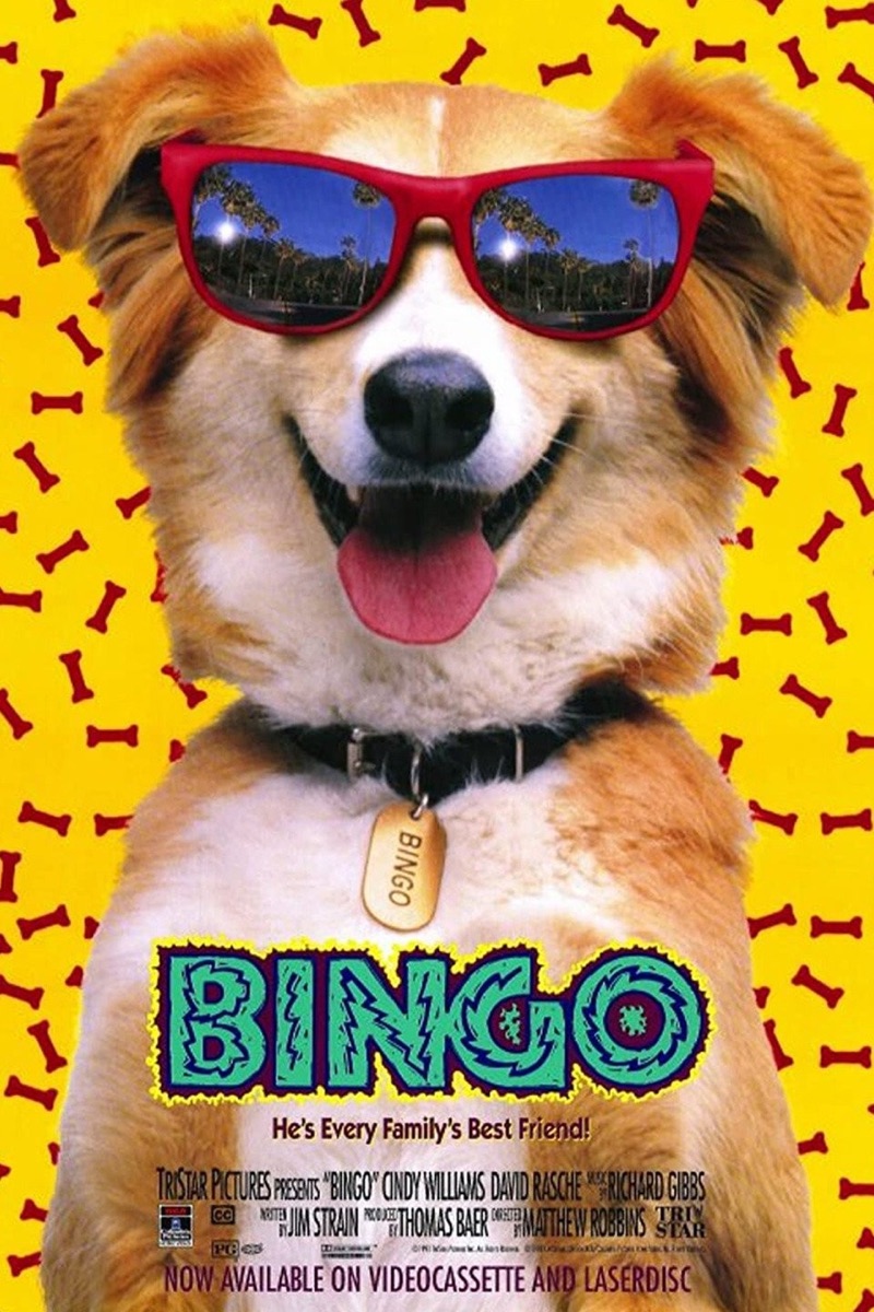
A very good dog in sunglasses, circa 1991
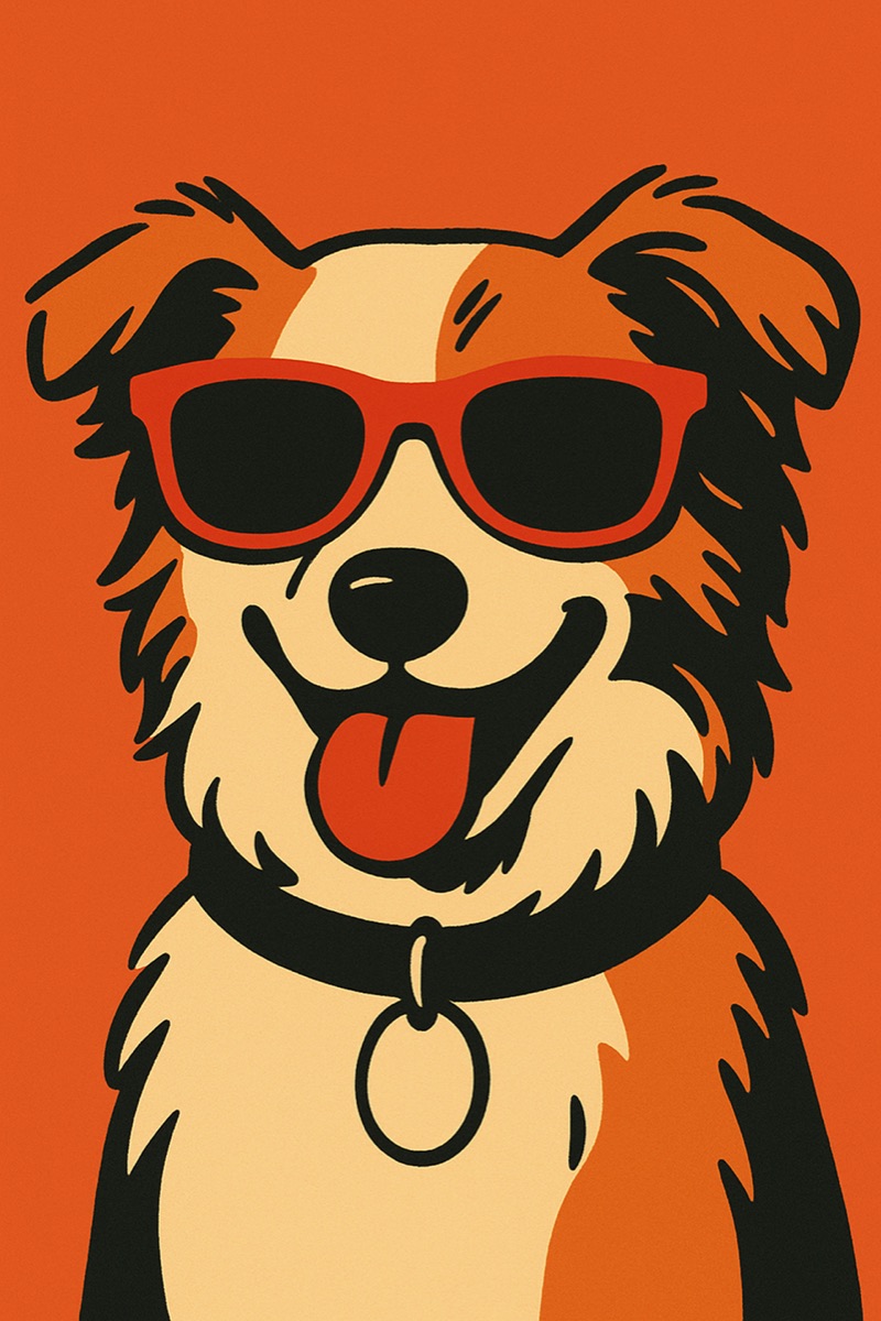
Automating illustration with Sora

Vectorizing instantly in Figma
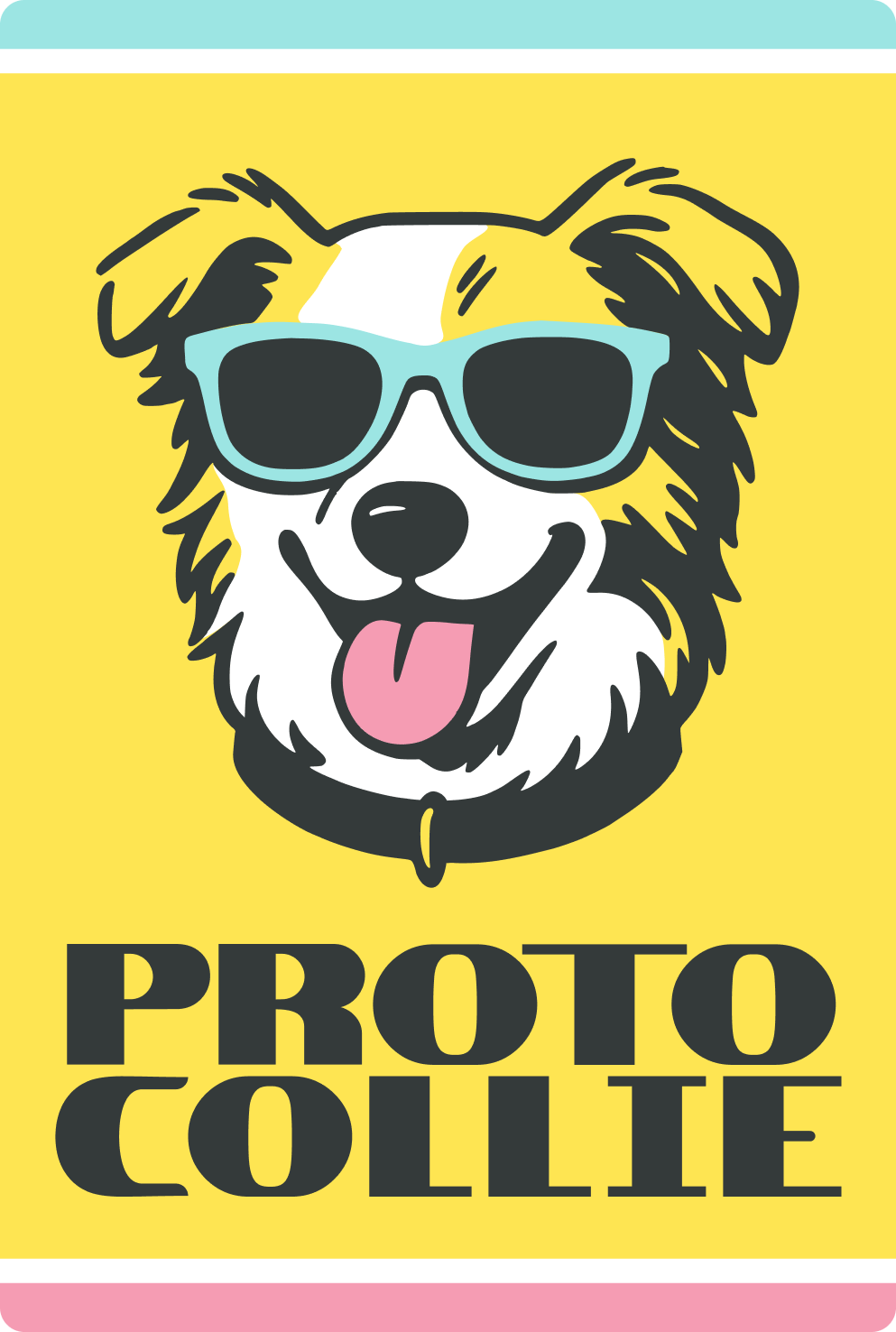
Isolating elements by hand for coloring
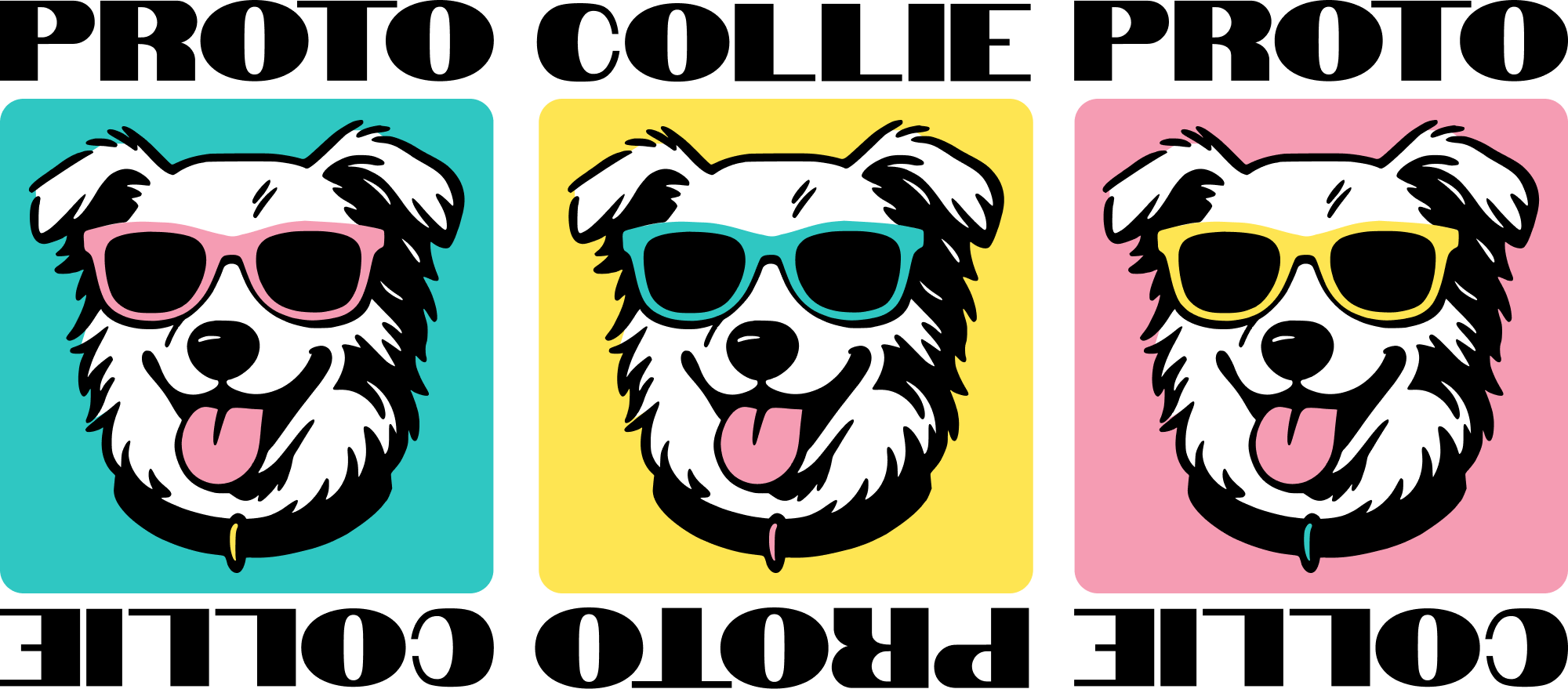
Early colorway explorations
The palette is doing a lot of the work. Yellow, mint, and bubblegum pink against a near-black, which gets you about as close to a 1990s software box as you can without printing one. The condensed slab logotype came off the same shelf, the kind of type that used to be screen printed on a floppy sleeve.
From the mark I built out the pieces Scott would actually need: an app icon that still reads at 32 pixels, a logotype for the site and the app header, a sticker for conferences, and colorways so the dog could show up in more than one outfit.


 Visit Protocollie.io ↗
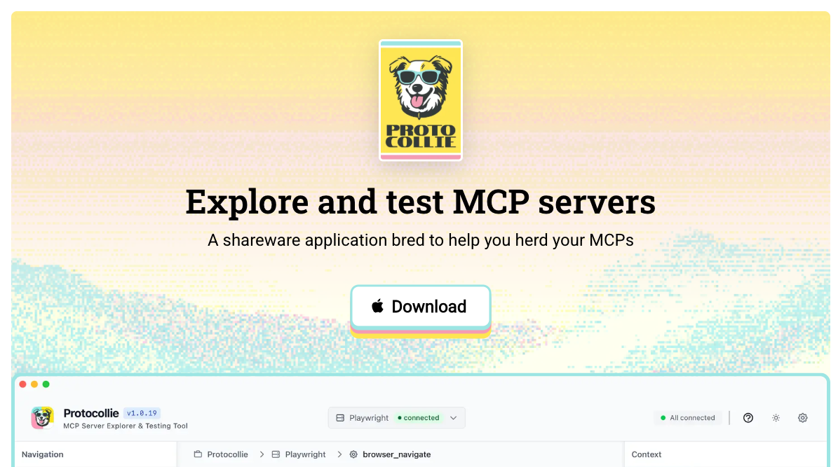
Protocollie.io landing page
Brand, site, and app all came together over a weekend, and we launched with the blog post instead of a campaign. Using Cursor as my copilot, I began vibe-coding polish and improvements to the marketing site. A dancy download button that felt satisfying to click and a straightforward set of screenshots was all that was needed for a "free" shareware app. Then we made a couple of joke sites for it too, because of course we did: mcphammer.com and mc3p.io.
It's been downloaded more than 200 times since, which is a good number for a weekend build we gave away on the honor system.
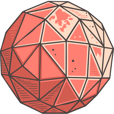
A community of developers defining Ruby's place in AI. Bringing together Rubyists who are building with, thinking about, and pushing the boundaries of AI tooling.
Visit the site at artificialruby.ai ↗Artificial Ruby is a community of developers exploring Ruby's place in an AI-first world. With a lot of AI tooling using Python due to better documented code, this was a community-first effort to keep Ruby in the conversation. We wanted to rekindle the spirit of the early computing era, back when a room full of people would build strange new things and show each other how.
A lot of it came down to ethos and people. Artificial Ruby builds community through regular in-person sessions: talks, demos, and conversations that make the case for Ruby as a serious place to build with AI. What started as a fun branding exercise turned into real events with real momentum.
The format barely changes, and that's on purpose. We meet at Betaworks, with pizza and drinks up front while people arrive. Scott kicks things off, thanks the sponsors, tells everyone when the next one is, and then two or three speakers give short talks on what they're exploring, building, or launching. Community announcements follow, and then everyone mingles until they get kicked out.
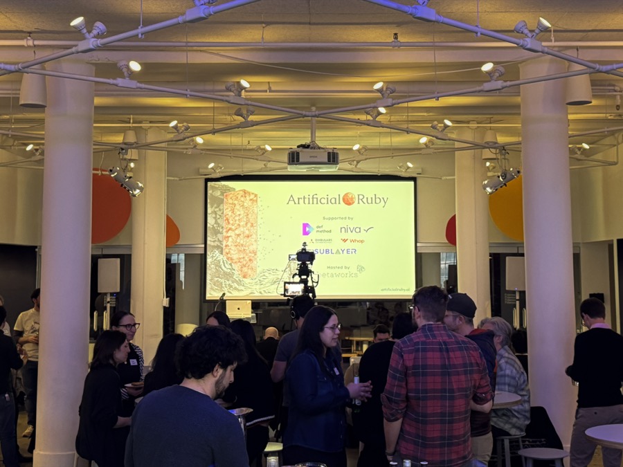
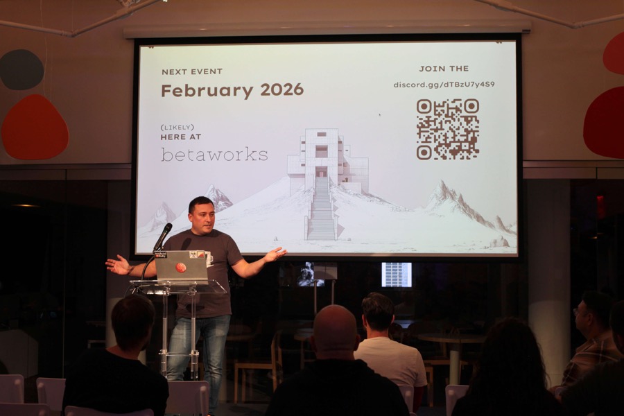
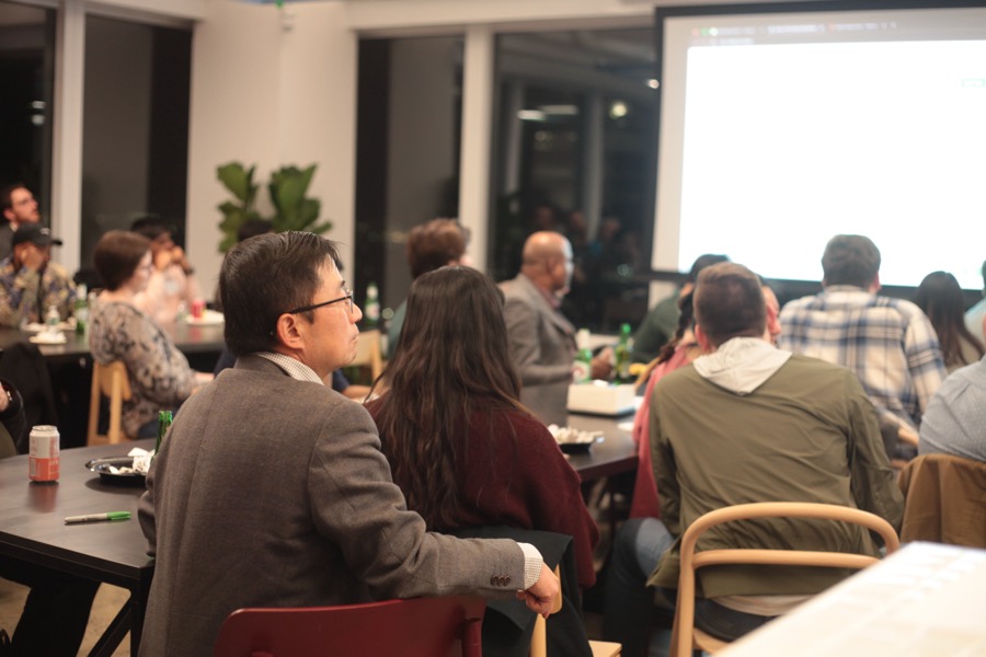
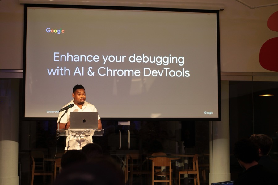
Monthly sessions in NYC: talks, demos, and the part where everyone stays late
We went looking for inspiration in something that felt futuristic and from the past at the same time. Apple's very first logo came to mind almost immediately: a company at the absolute cutting edge, wrapped in a mark that looked like it had been engraved a hundred years earlier. From there we landed on early computing: homebrew clubs, Xerox PARC, people in ties hunched over CRTs. That's the period we felt like we were living through, only it's AI this time. To see whether the two worlds could actually share a frame, I explored the idea in Midjourney with the prompt: “minimalist etching of an 13th century explorer holding a computer keyboard and gigantic ruby.”
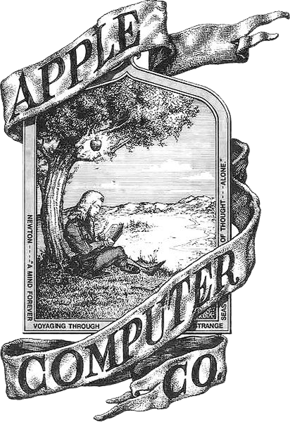
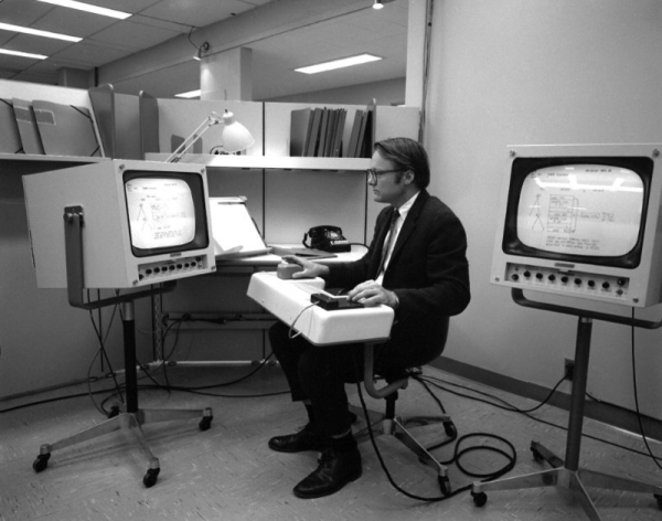
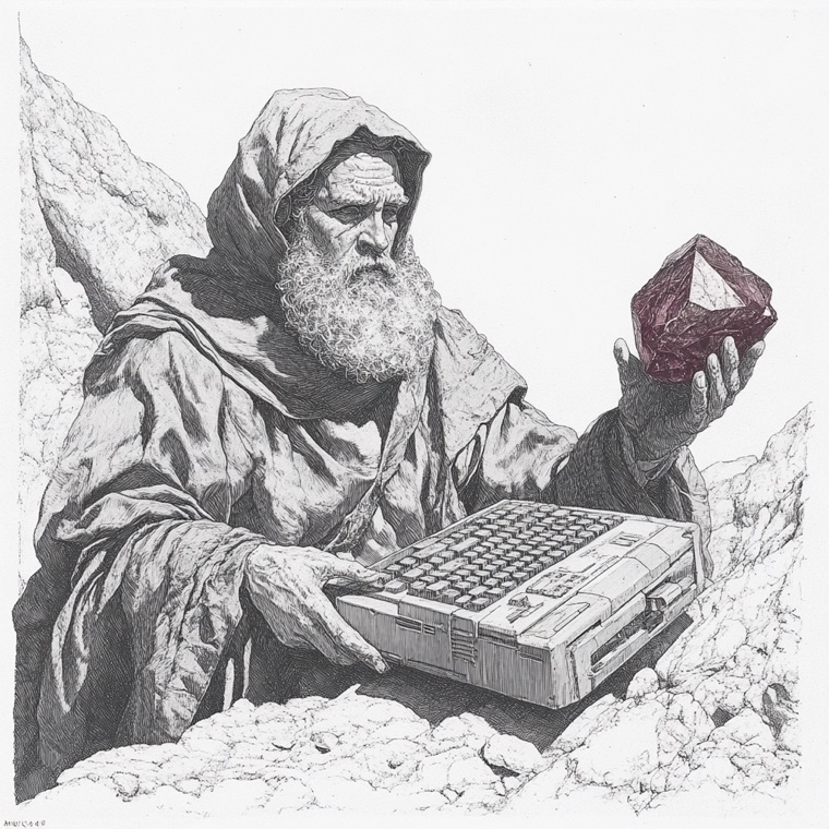
Finding Inspiration: Apple's surprising first logo, the early computing era, and a Midjourney generation mashing up ancient and future through etchings
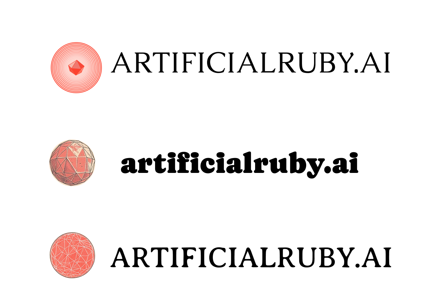
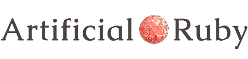


Pairing the gem with type was its own round. The concentric-ring version read as a signal broadcast but lost the gem; the heavy slab felt like a soda brand. The engraved sphere with a classical serif won, because it looked like it had been printed on something in 1890. That resolved into the mark on its own, a primary horizontal lockup, and a stacked cut for square spaces.
The gem at the center of all of them took four steps to get right.
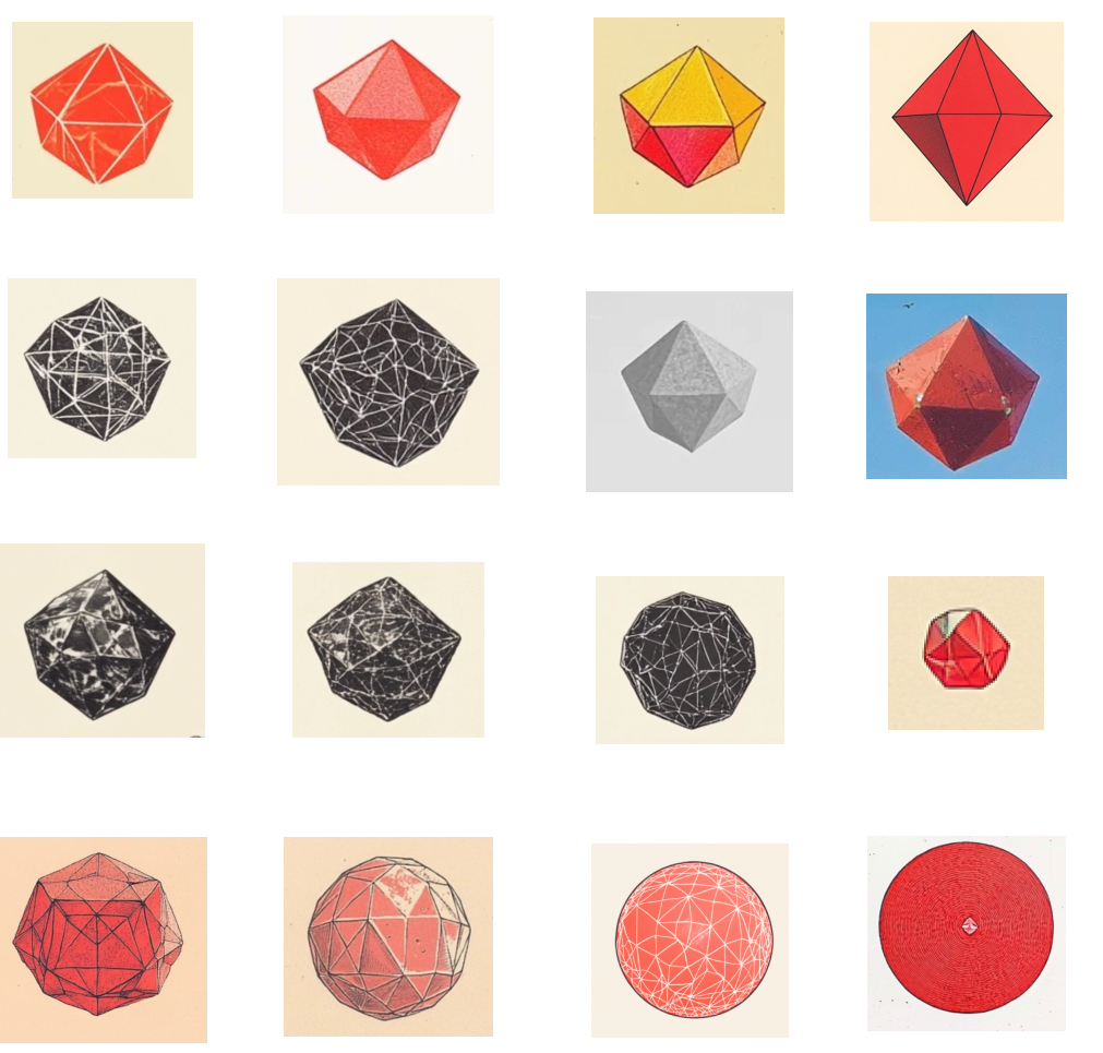
Midjourney explorations of a ruby gem
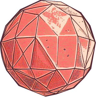
Choose the hero gem
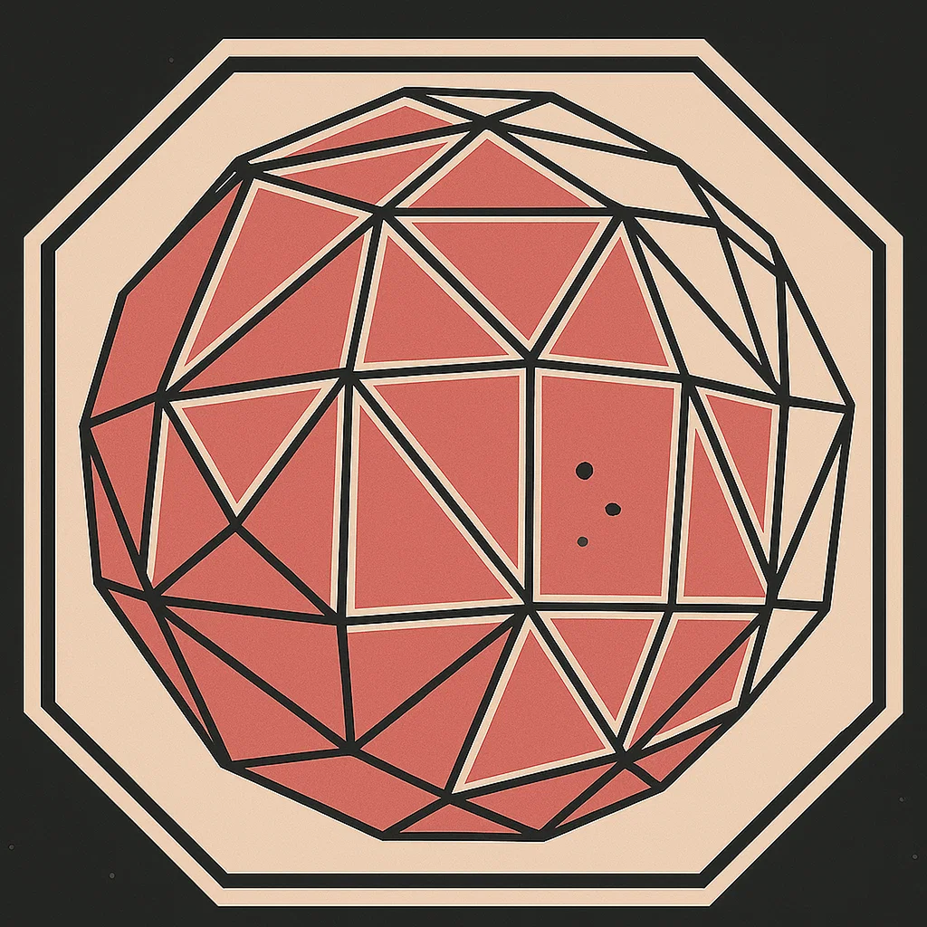
Asking ChatGPT to simplify the hero
Raster-to-Vector with a lil' cleanup and polish
The process ended up mirroring the community's whole thesis. Use AI to get moving, then put human hands on it. Midjourney got us a direction, and I hand-finished the final mark into clean vector.
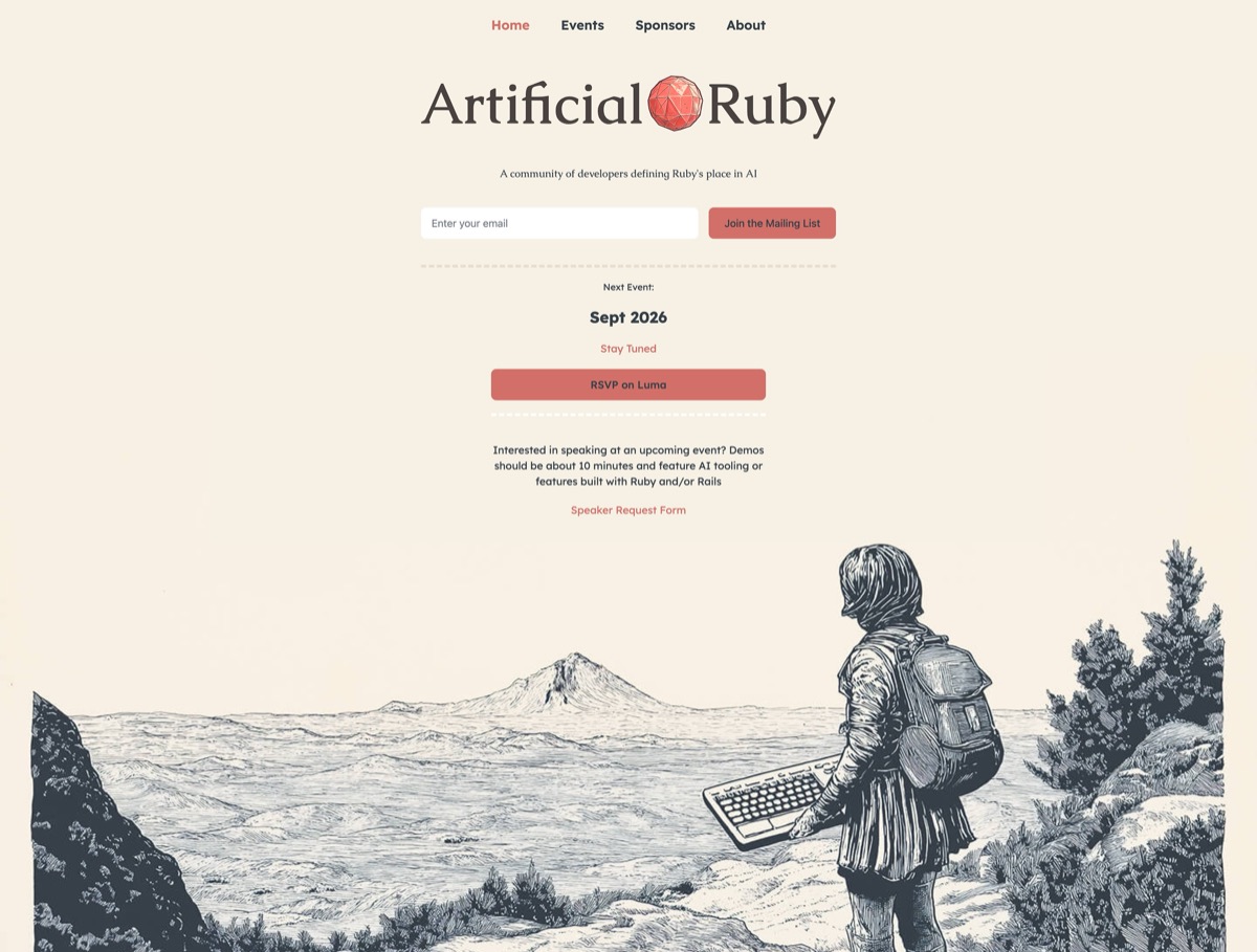
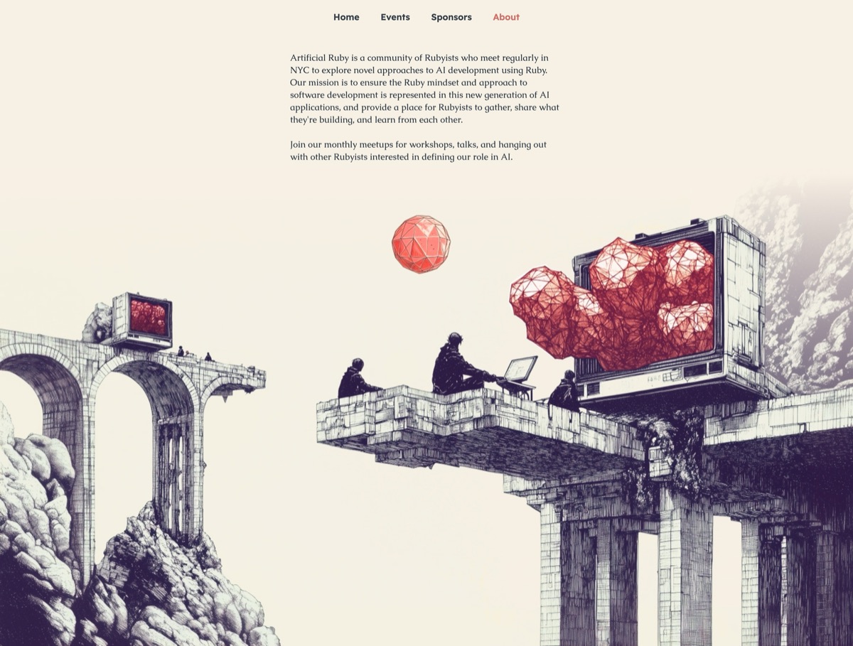
The site was the first place the world of Artificial Ruby actually existed. Everything before it was a logo. The site was where the fiction finally got room to breathe: a distant future that felt like the past, built out of etchings, explorers armed with retro tech, and a mysterious ruby-like object that shows up like it's always been there. Anyone landing on it should get the joke and the ambition at the same time.
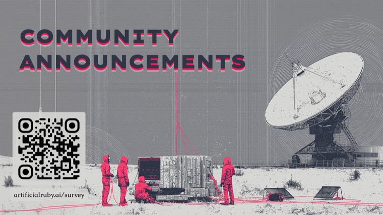
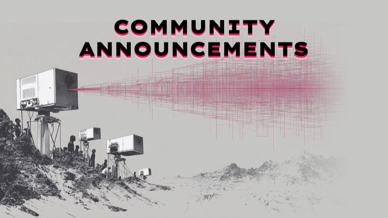
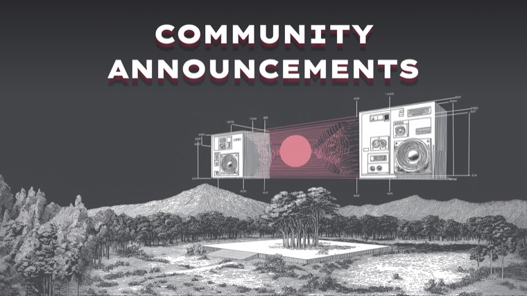
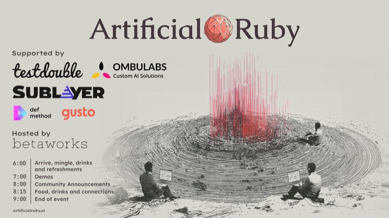
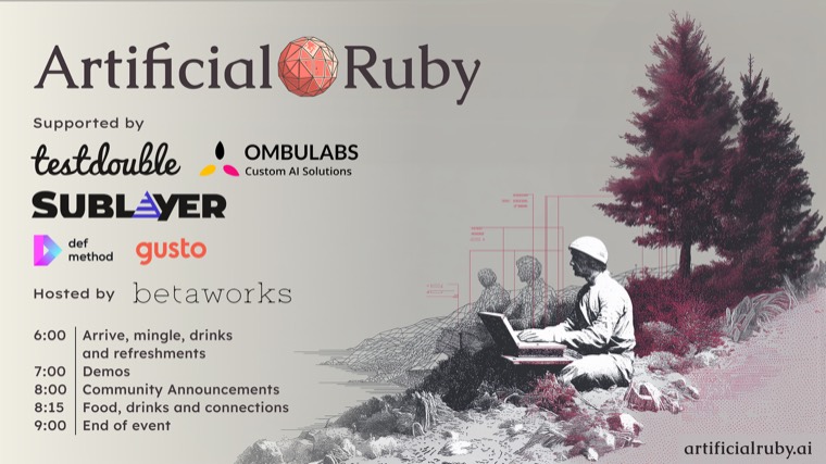
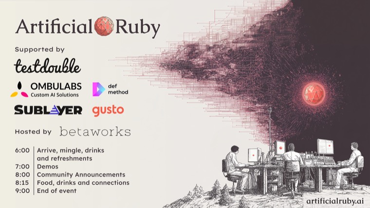
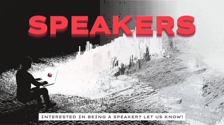
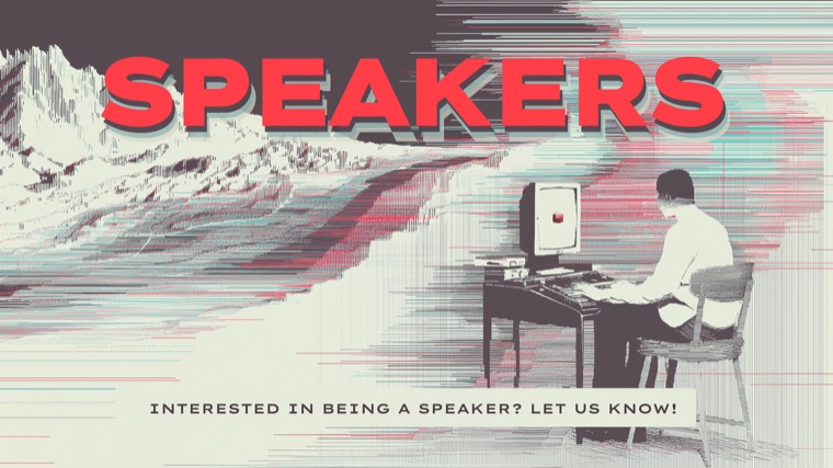
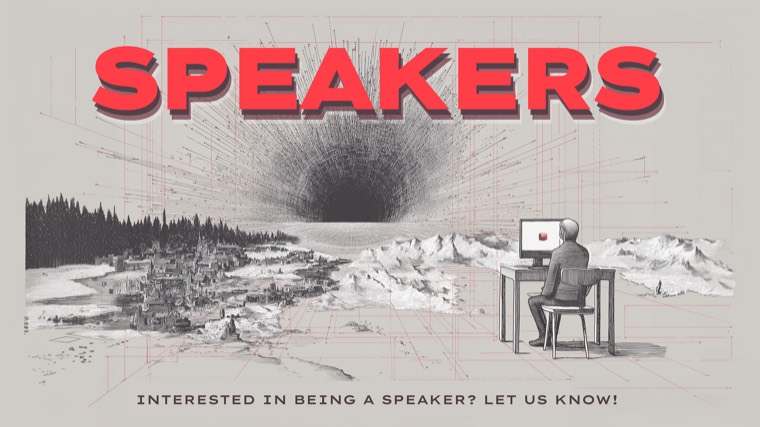
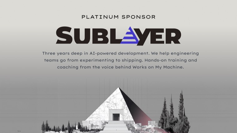
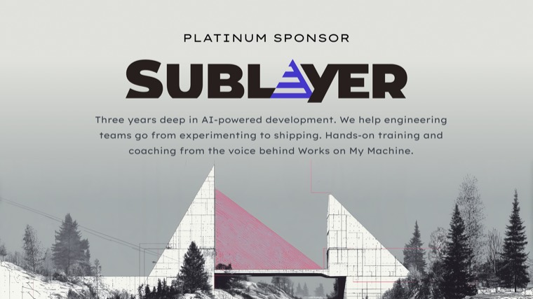
Every event needed a deck, and every deck needed to look like the same community. I built a slide system on top of the identity, covering titles, speaker intros, community announcements, and sponsor thank-yous, so any organizer could assemble a night without redesigning it from scratch.
I made sure each event had its own chance to world-build, using AI-generated imagery to tell a quiet backstory in the margins. Same retro-futurist world, moving one frame further along each month.
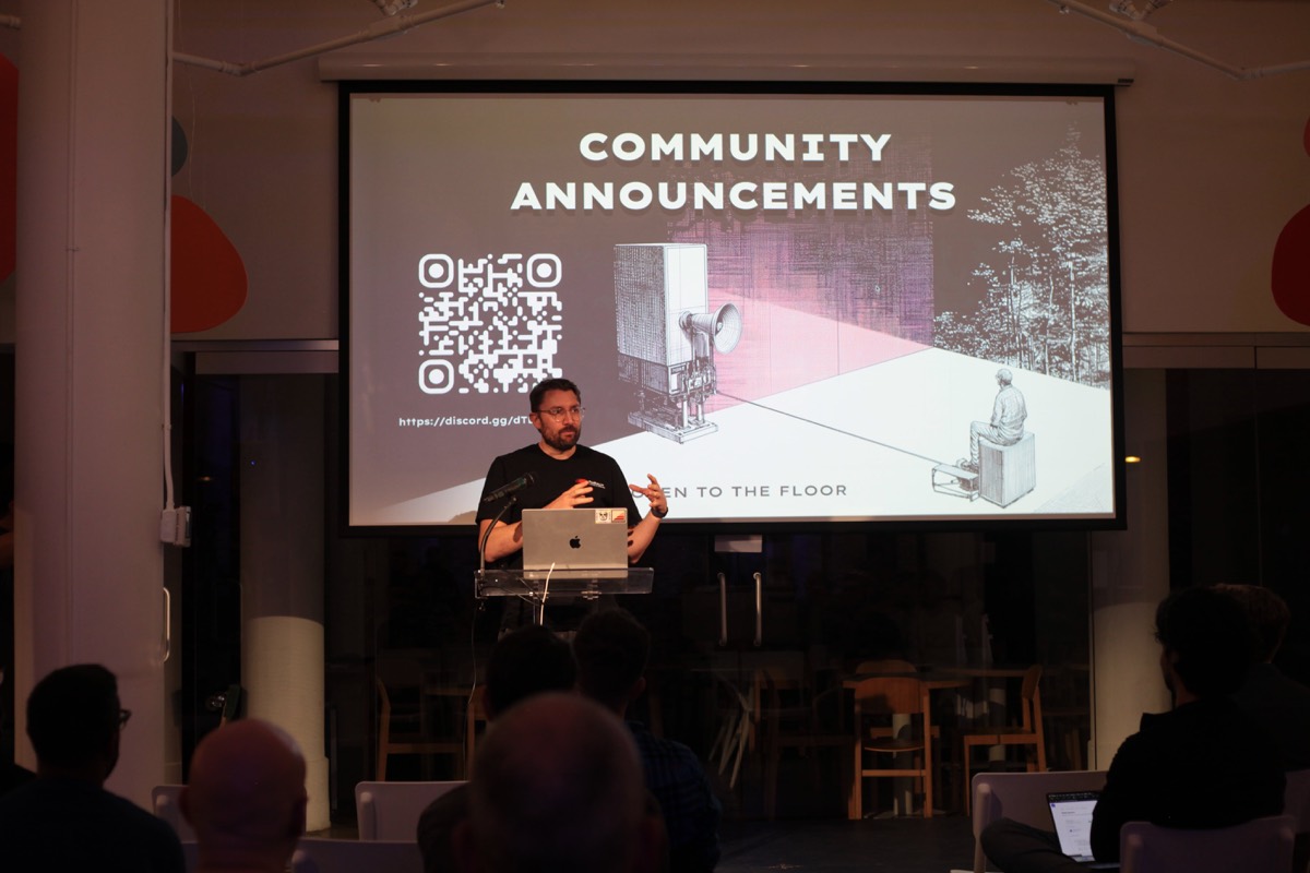
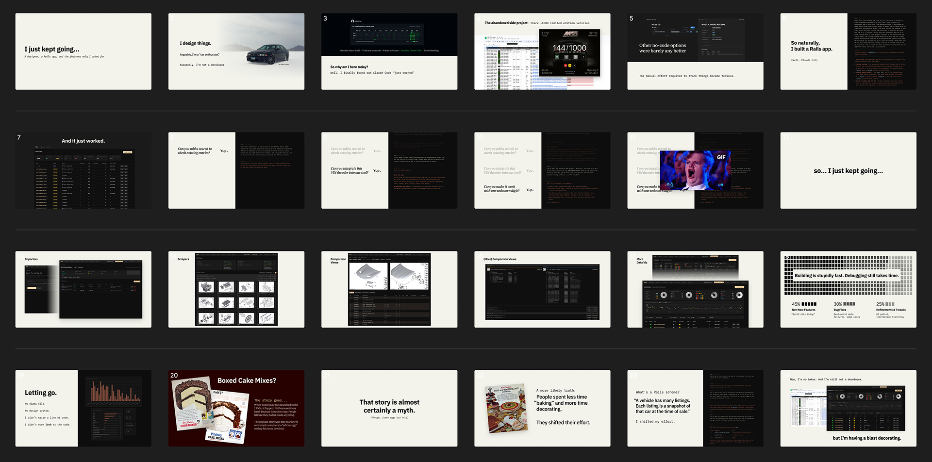
Then I got on the other side of it. In March I gave the talk myself: a designer, a Rails app, and the features only I asked for. No Figma file, no design system, and I never looked at the code. It was the Artificial Ruby thesis pushed about as far as I could take it, and it carried straight into what I'm doing now at M5CS (case study coming soon).
All three came down to the same bet: when code is cheap, design is the moat. Artificial Ruby was permission to have fun and build a community around it. Protocollie had to earn trust that a weekend build doesn't usually get. Augmentations had to differentiate in a crowded field. Three different goals, and craft was what made each one feel real.
It also meant working at the speed of an agentic studio: decide early, invest in the foundations (brand systems, tone of voice, a human-designed mark), then stay loose on everything else. Sometimes the right call is to stop, and putting Augmentations into stasis took as much design judgment as any pixel did. Most of the job is figuring out which decisions are load-bearing.