
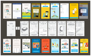
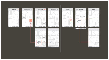
My first major project at Timehop was redoing their signup process and user onboarding. The objectives for the redesign were to streamline the overall flow and to add a Phone Number Login option for users alongside the existing Facebook Login.
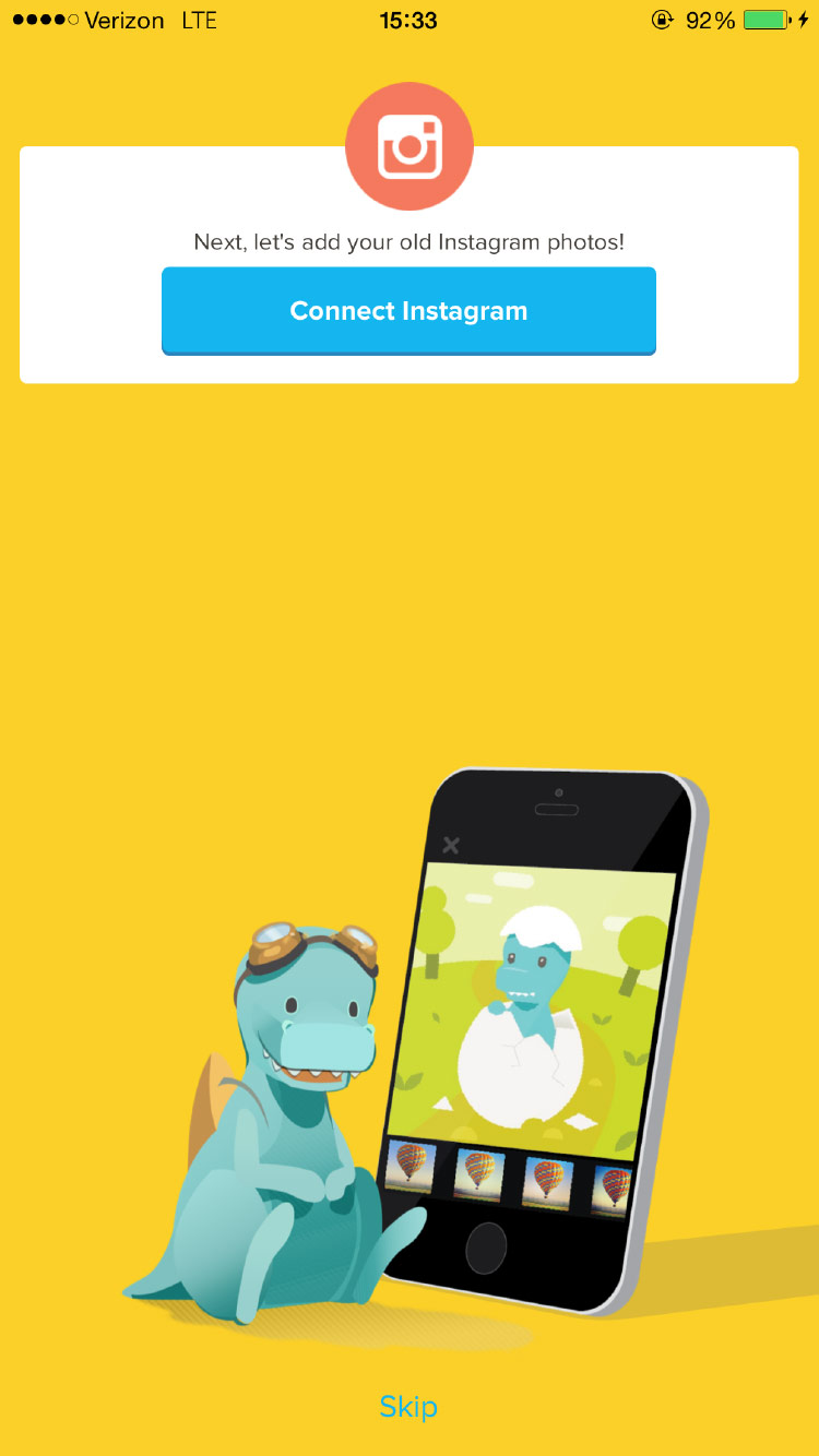
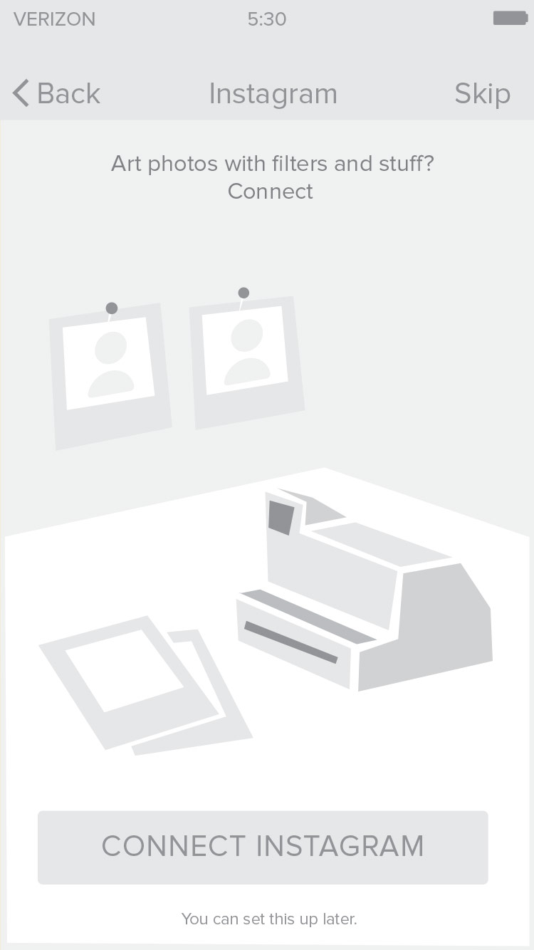
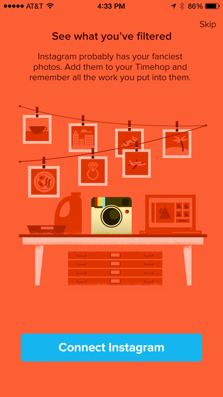
Working with a project manager, we developed a "story" to bring users along the 20+ steps of the signup flow. The story we landed on involved visualizing our content sources around a "house" of memories. I found, hired, and managed a freelance illustrator to bring the story to life. In 2018, we added a new feature to the process that would give new users the chance to experience some of the functionality of Timehop before signing up completely.
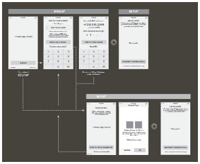
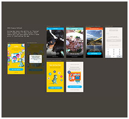
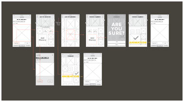
Phone Login Wireframes
Onboarding Overview
2018 Signup Refresh
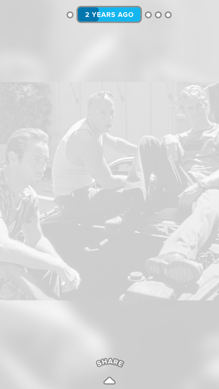
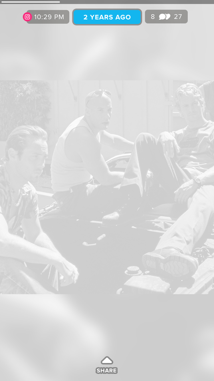
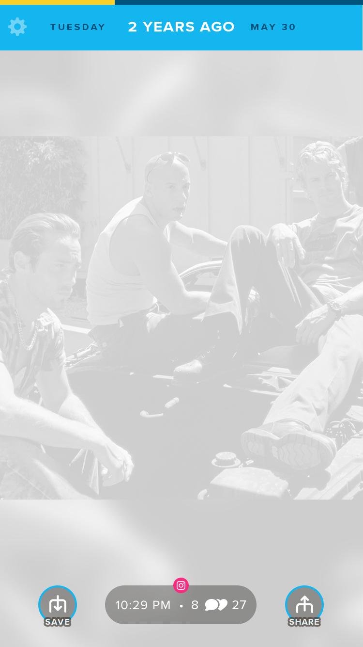
It's important to note that Timehop underwent a major and complete redesign. From the ground up. Why? There's a long answer, but the TL;DR is that the app that scrolled vertically changed to a "fullscreen experience" that taps/swipes. Ultimately, this was to improve ad revenue.
Old Timehop
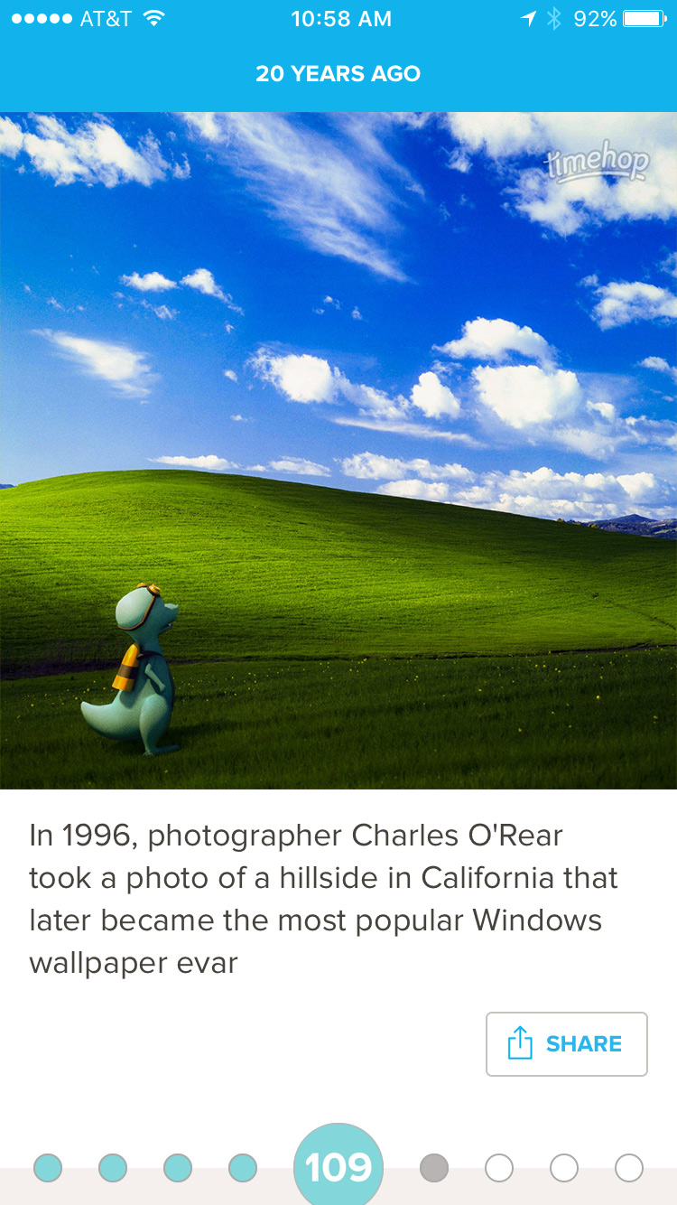
New Timehop
Internally, the newest version of Timehop was dubbed 4.0, it launched in December of 2016. The previous version, Timehop 3.0, wasn't fully phased out, so many of the elements of the app had to live in and function in both versions of the app until 3.0 was completely shut down in 2018.
Product Direction, UX, UI, Visual Design
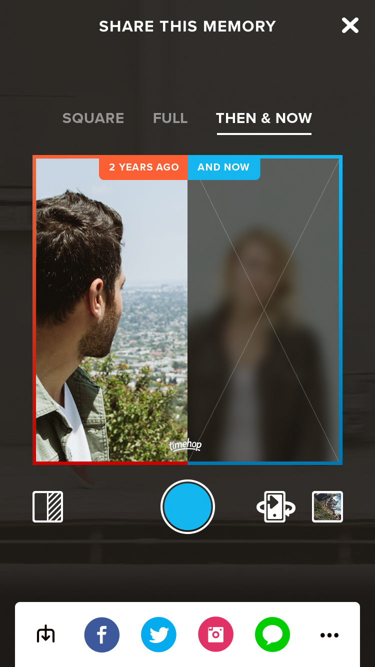
Designing the overall look and feel of the new fullscreen Timehop involved a staggered roll out and small redesigns as user feedback came in. Primary objectives were to improve the user experience by bringing back functionality that was deemed non-essential for launch and iterating on new designs for text posts, albums, and the sharing UI.
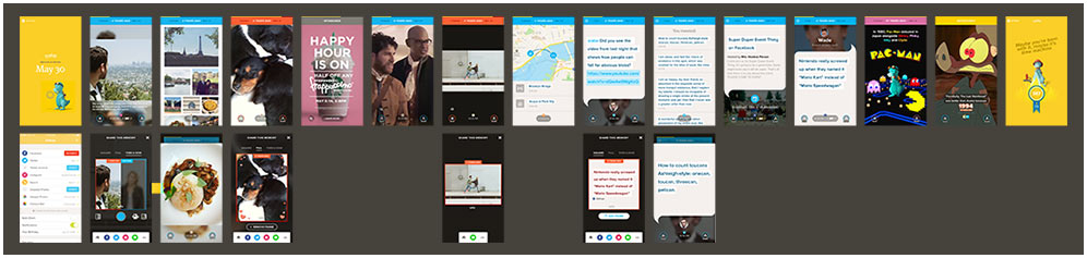
Pretty much every screen in the app
UX, UI, Visual Design
Creative Direction, Copywriting, Research
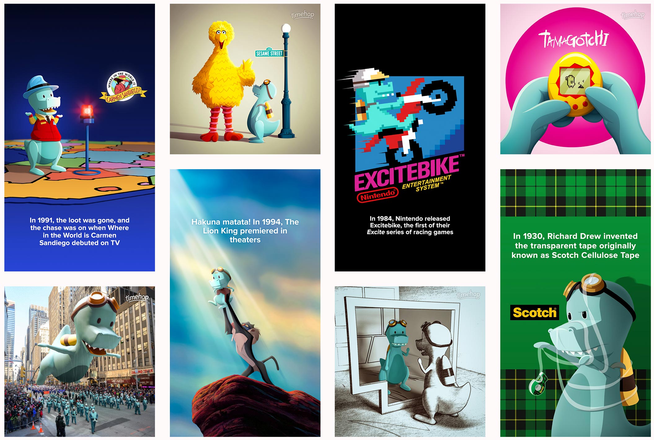
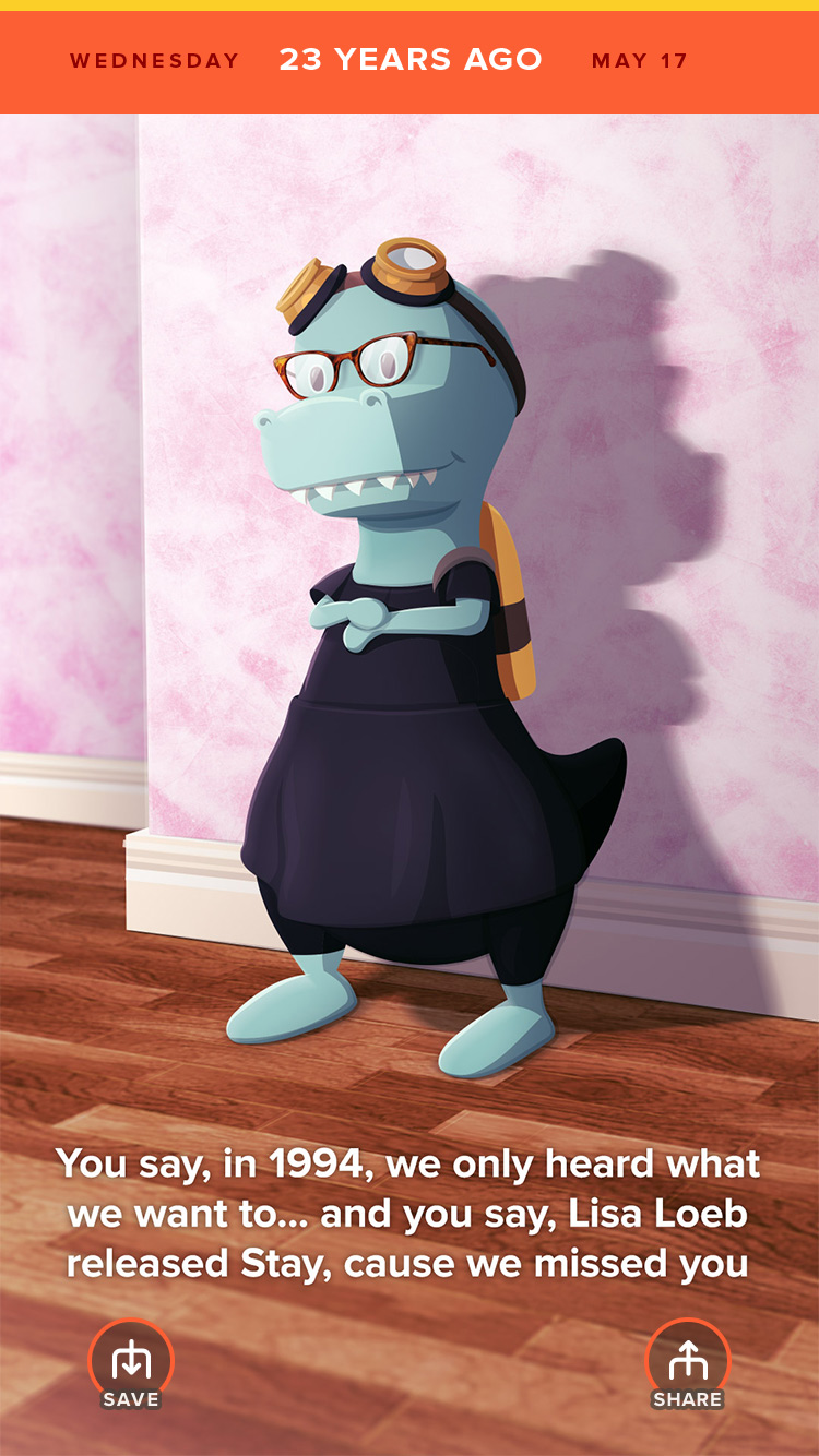
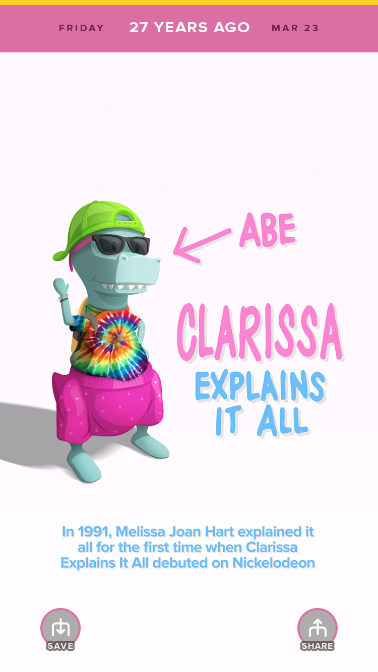
Timehop ends every user's day with a newsworthy event that happened "on that day" in the past. Shortly after I started, I volunteered to overhaul and manage the news entirely. To do this, I implemented the following:
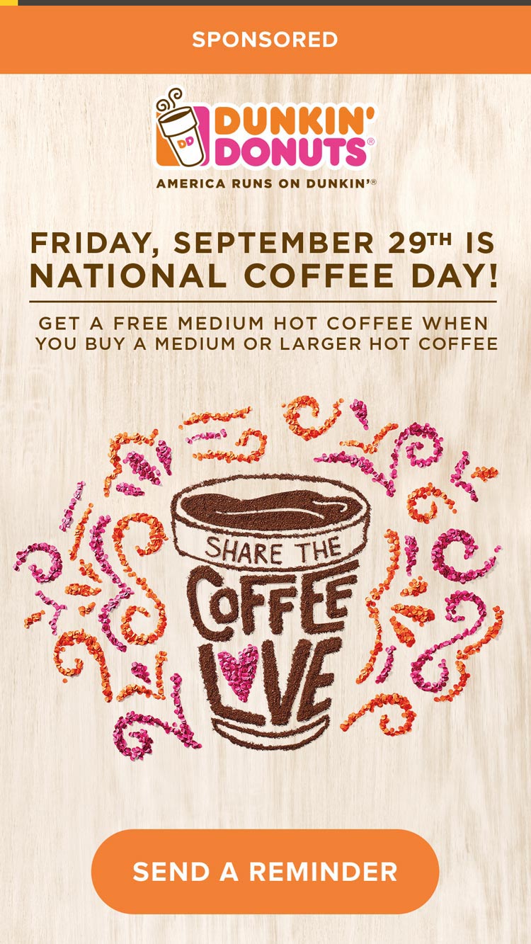
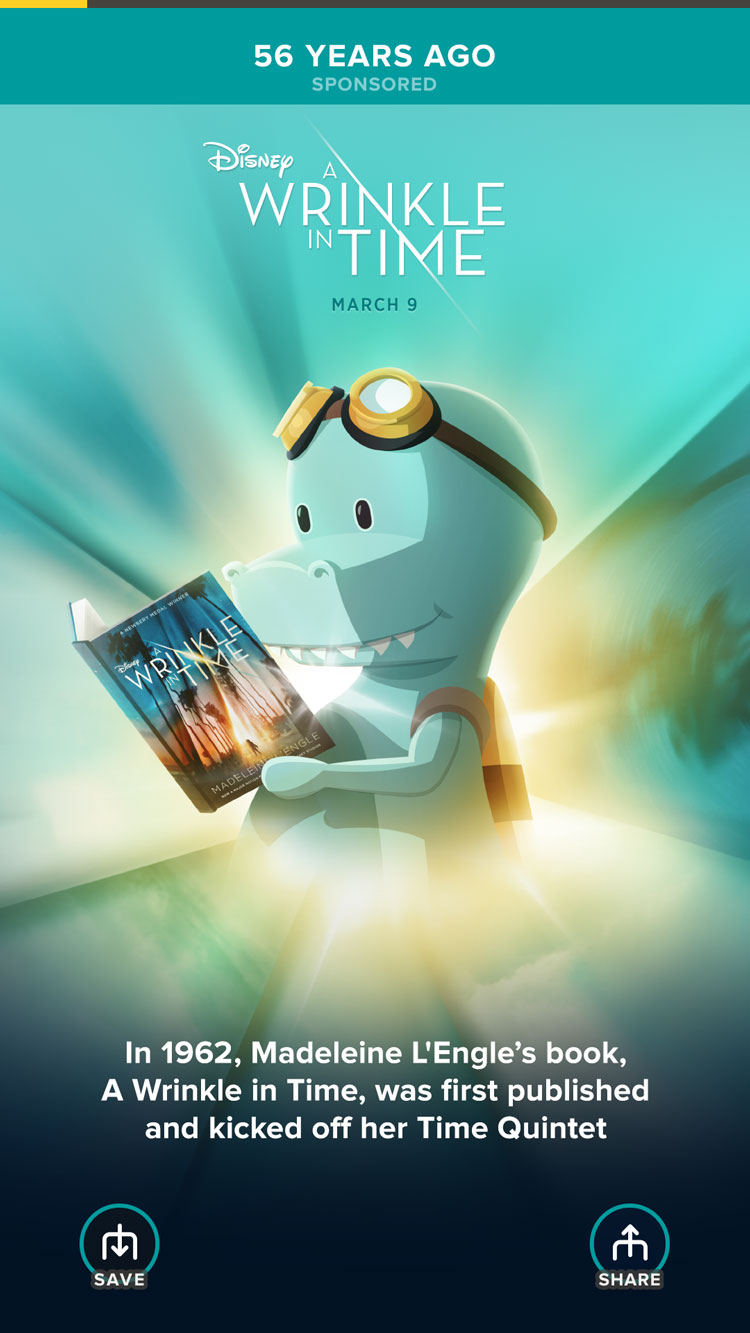
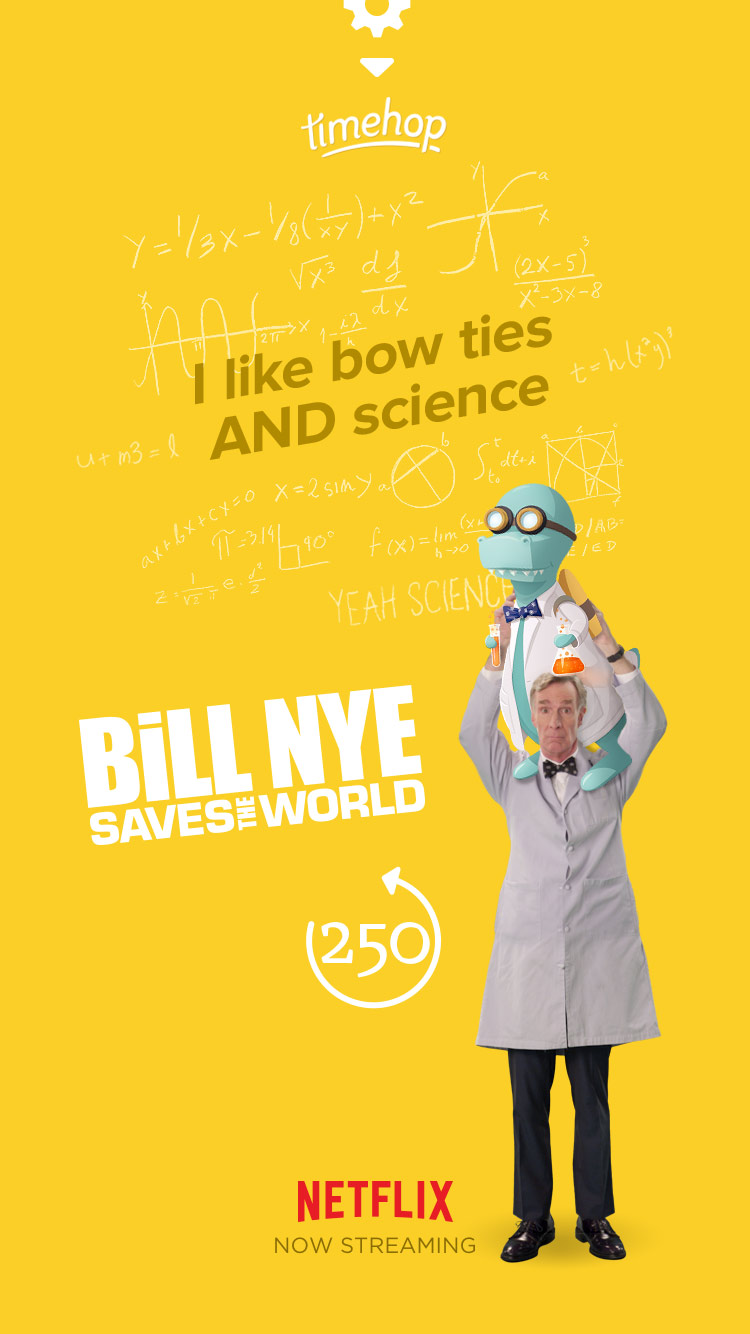
Monetizing Timehop meant kicking off advertising. To lay the ground work, all ads were done as partnerships between Timehop and the clients. The first units were all custom built one-offs by us, where I oversaw the design efforts and implementation of the client's creative needs.
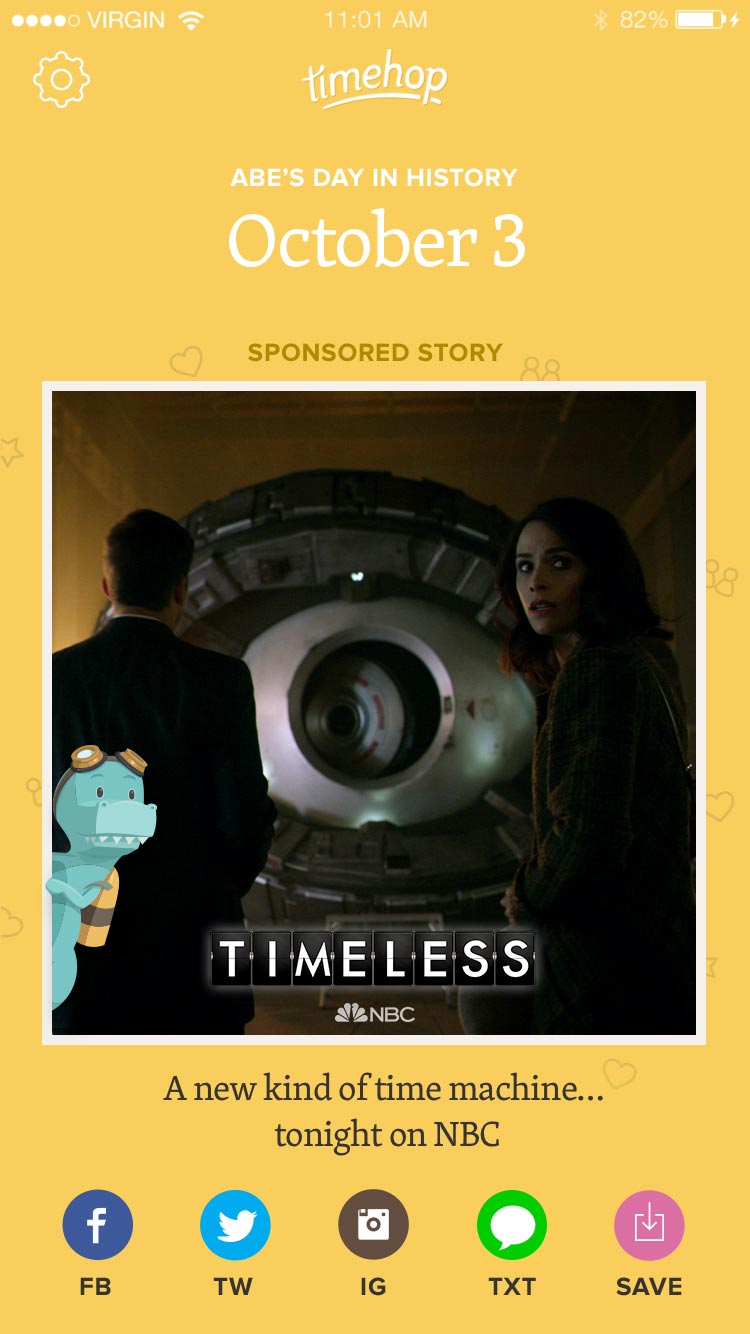
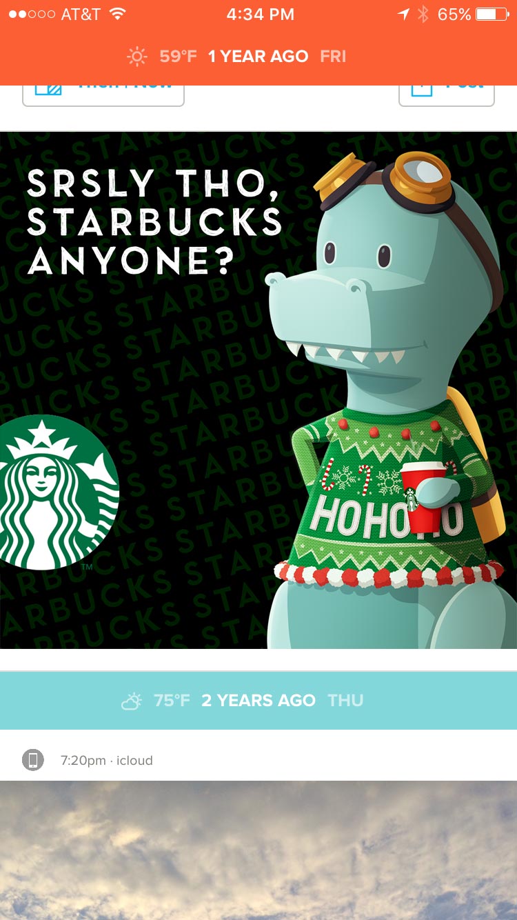
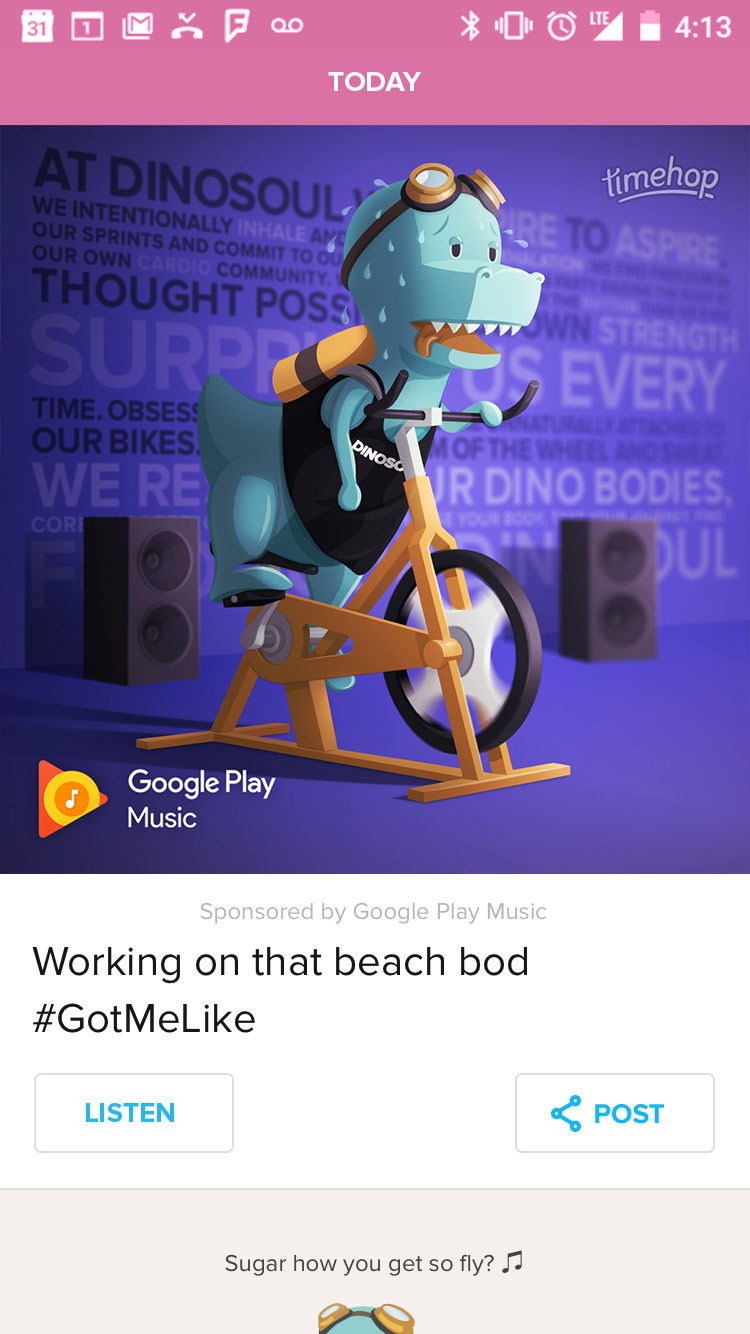
By the time 4.0 had launched, ad partnerships continued to allow custom units, but we also standardized the most common units to make implementing on our end easier and more cost effective. I worked alongside our marketing team and engineering team to standardize our efforts, reducing internal overhead when running ad partnerships.
Pretty much did what Product Designers do
My time at Timehop began with a proof-of-concept feature. The goal of the project was to build out more social interactions BETWEEN Timehop users and encourage new functionality beyond daily viewing and sharing.
While this project never officially launched, I worked with the CEO directly to narrow down his goals for social and articulate ideas from a brainstorm into a working prototype.
"Yearsbooks" was one of two ideas that came to life with the intention of letting users save memories "beyond the day of" and share those favorite memories with friends inside the app.
Add to a "Yearsbook" flow
Move/Remove Item flow
👋